Northern Powergrid
Brand Strategy • Visual Identity • Brand Development • Digital & Print Design • Art Direction
What I Did
Brand Development
Creative Direction
Design Systems
Visual Rollout
The Brief.
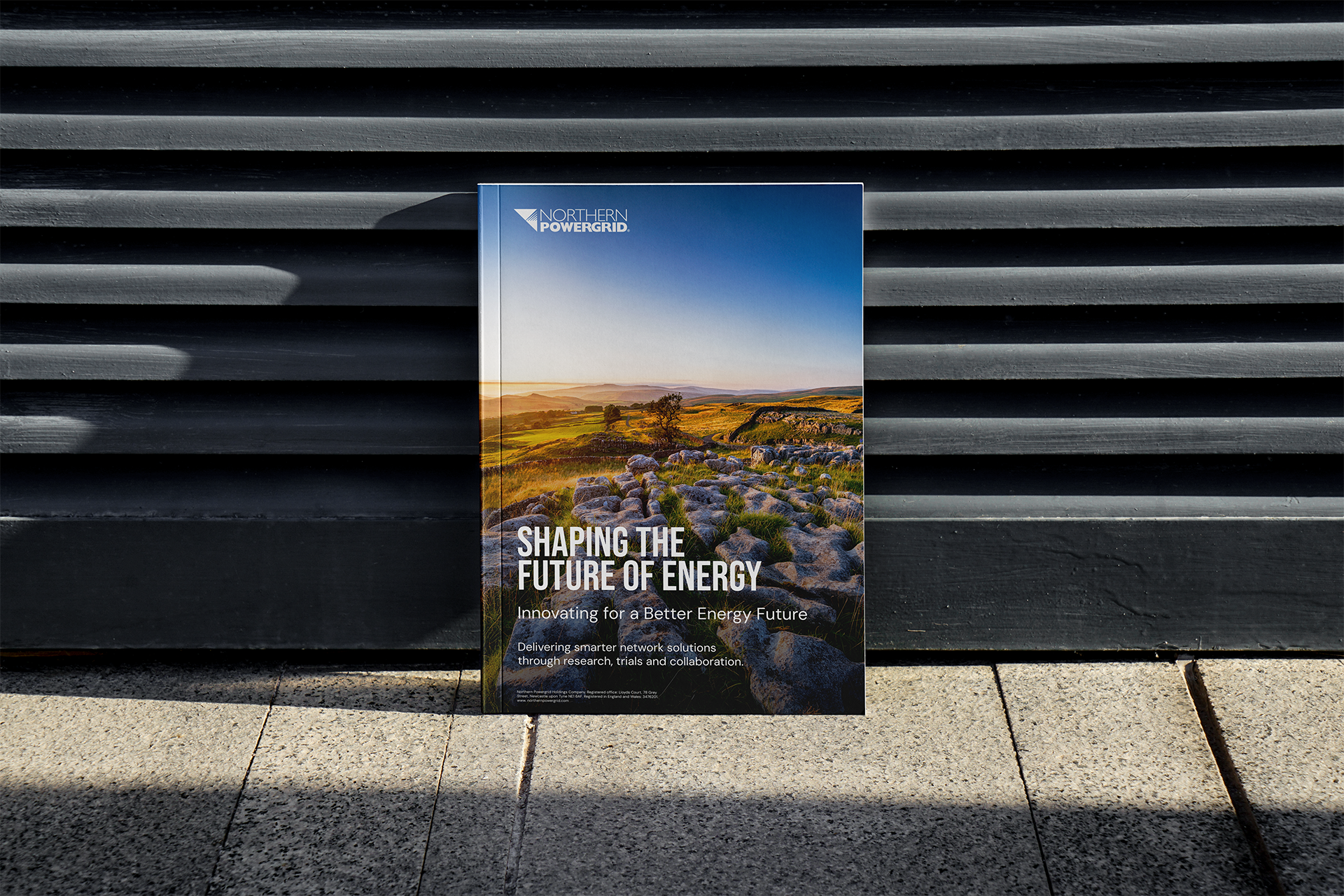
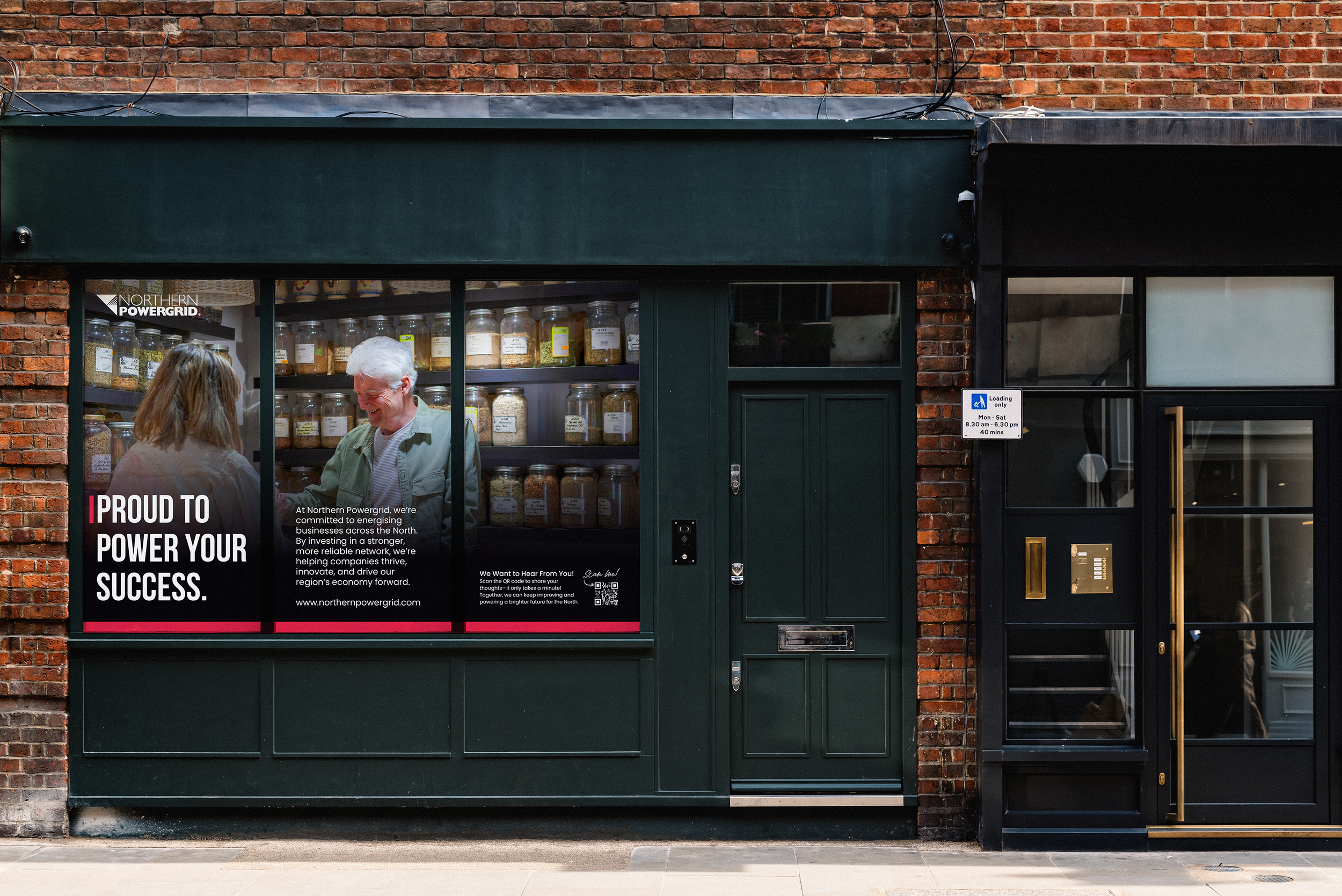
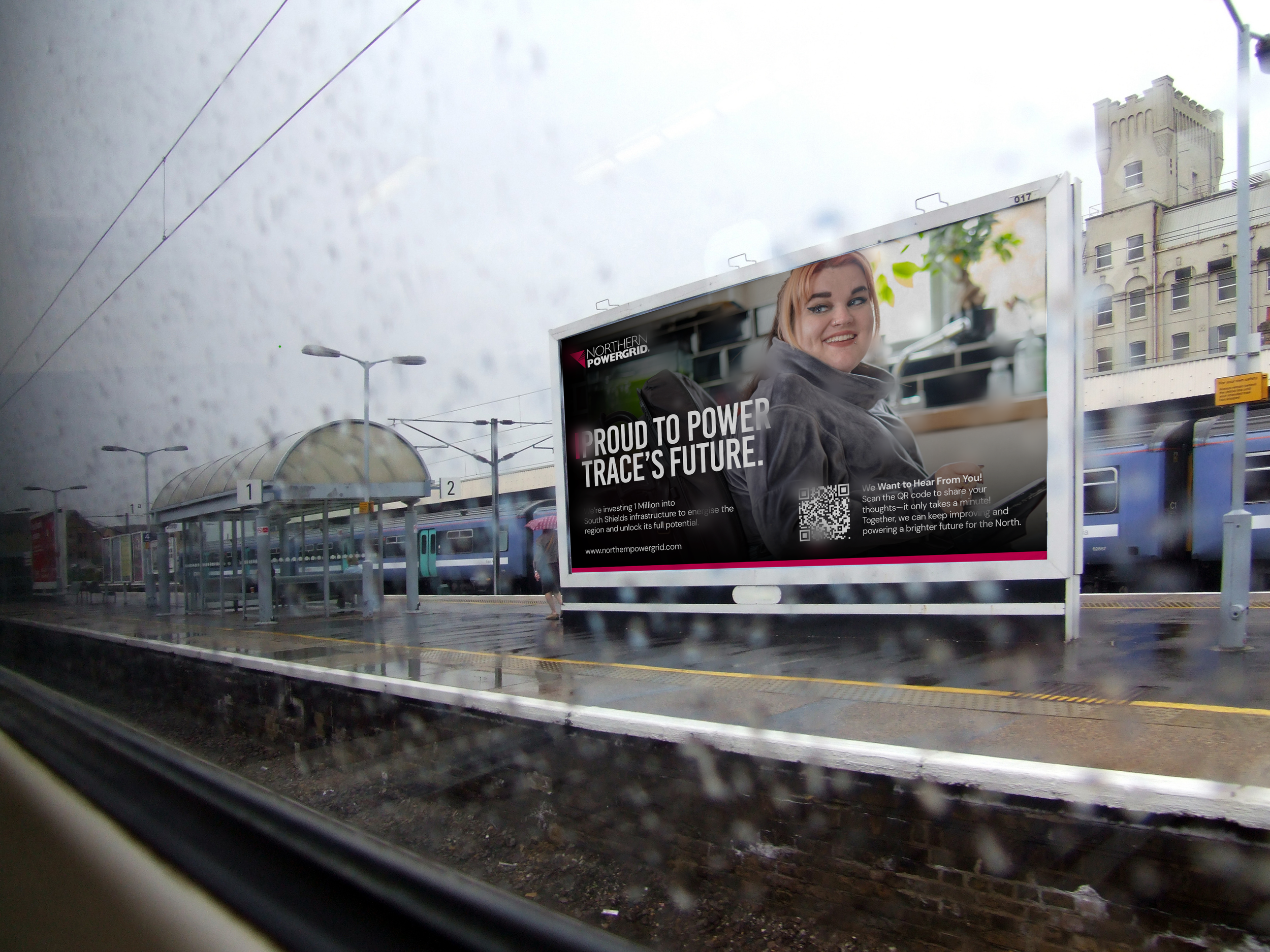
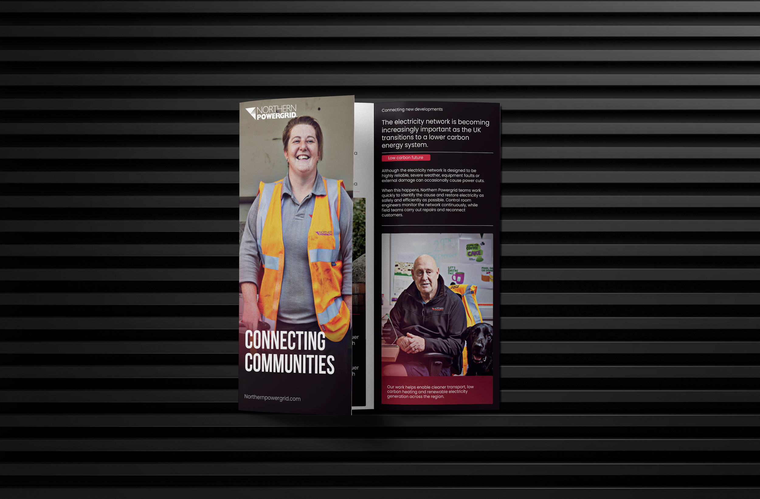
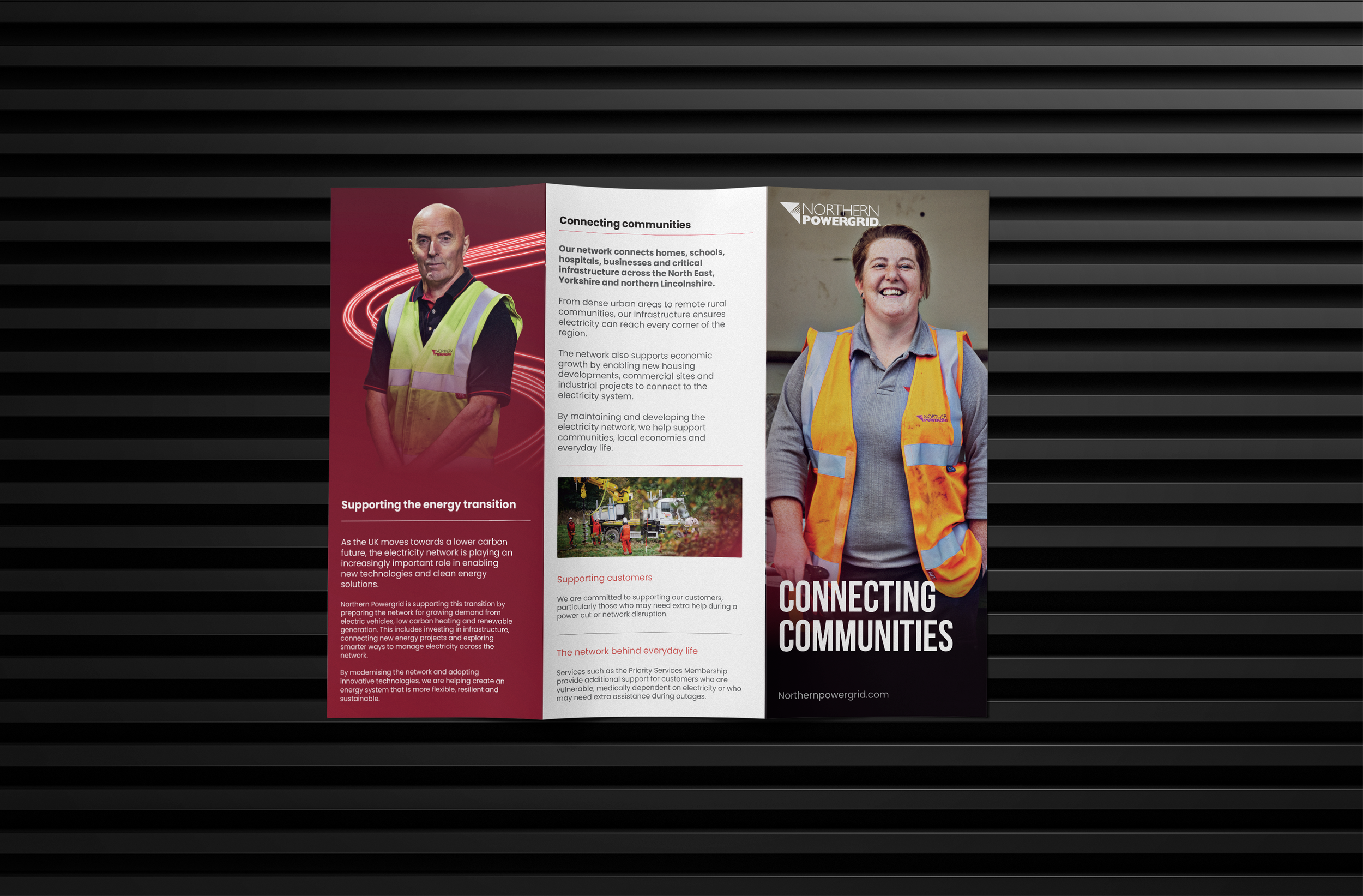
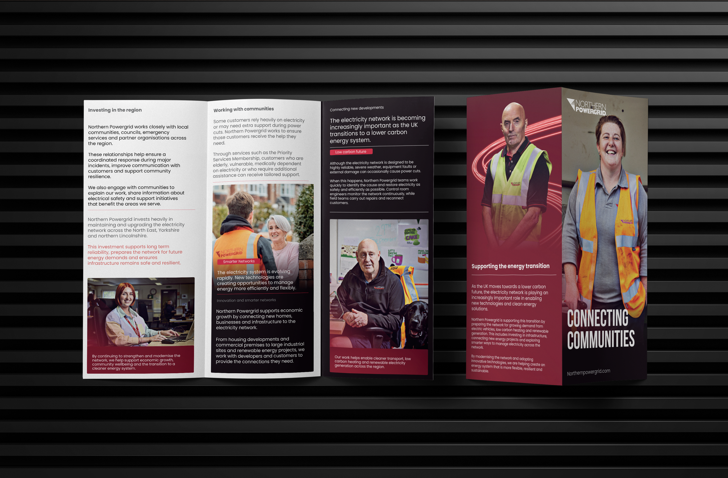
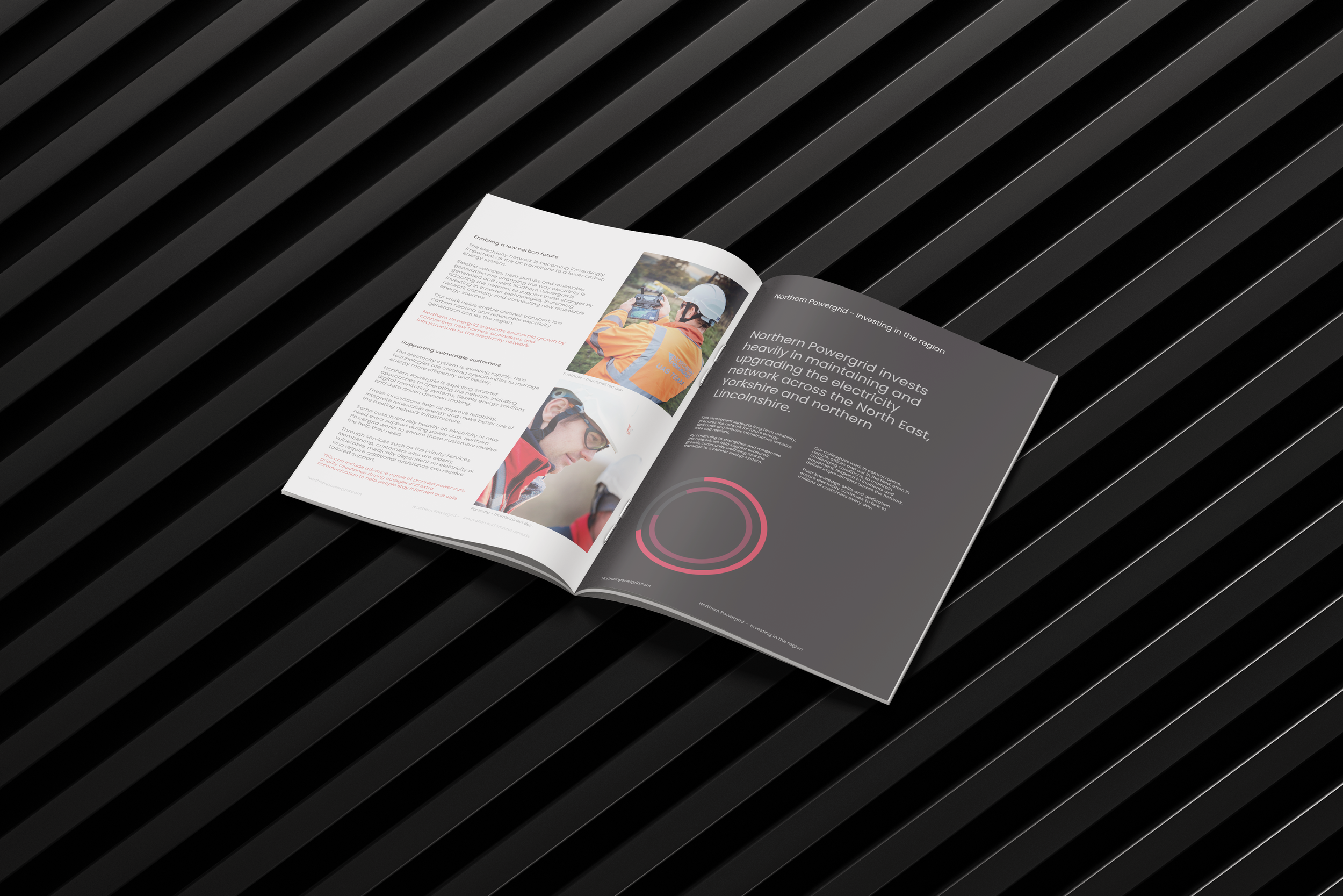
A unified external brand designed for clarity, visibility and public trust.
Brand Development & Guidelines
Client: Northern Powergrid
Role: Lead Designer / Art Director
View the website
www.northernpowergrid.com
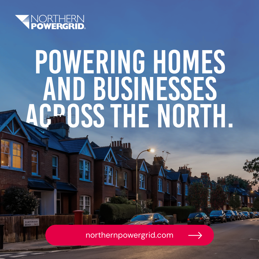
Northern Powergrid needed a clear and consistent external identity that could reach and resonate with more than 8 million customers across the North East, Yorkshire and northern Lincolnshire.The existing visual style had become inconsistent, with multiple versions of the core red palette, several type styles and no clear visual framework. As a result, customers struggled to recognise the brand across different communications.
The brief was to create a strong and unified external identity, supported by a scalable design system that could bring consistency and clarity across customer communications, digital platforms and public messaging.


The Approach.
Strengthening the Brand with Clarity and Consistency
Stakeholder and customer research carried out in 2024 helped shape the direction of the brand. The survey showed that around 8 in 10 respondents said they trust and rely on Northern Powergrid, highlighting strong confidence in the organisation. However, the feedback also revealed that a significant number of respondents felt the brand lacked a clear sense of character, indicating an opportunity to strengthen how it presents itself.
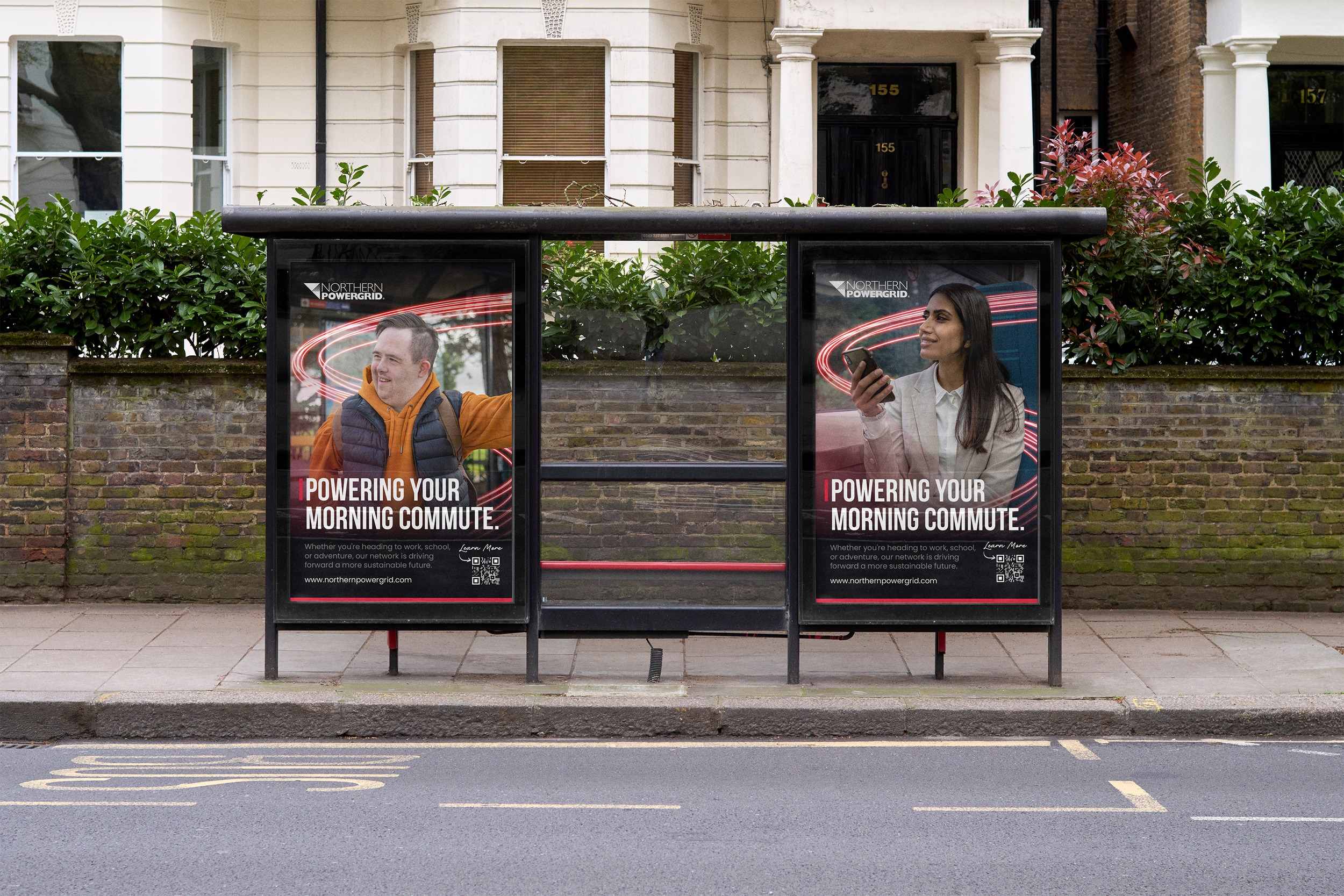
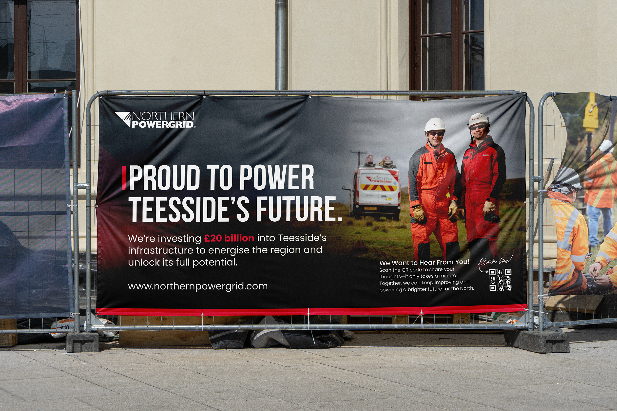
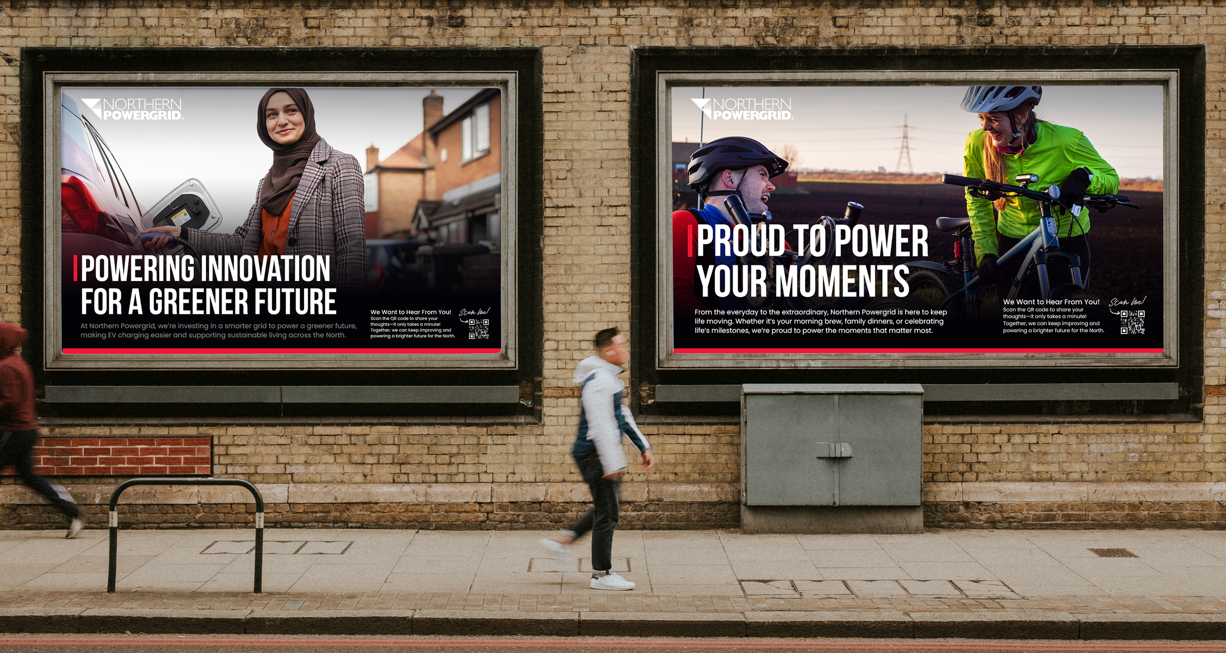
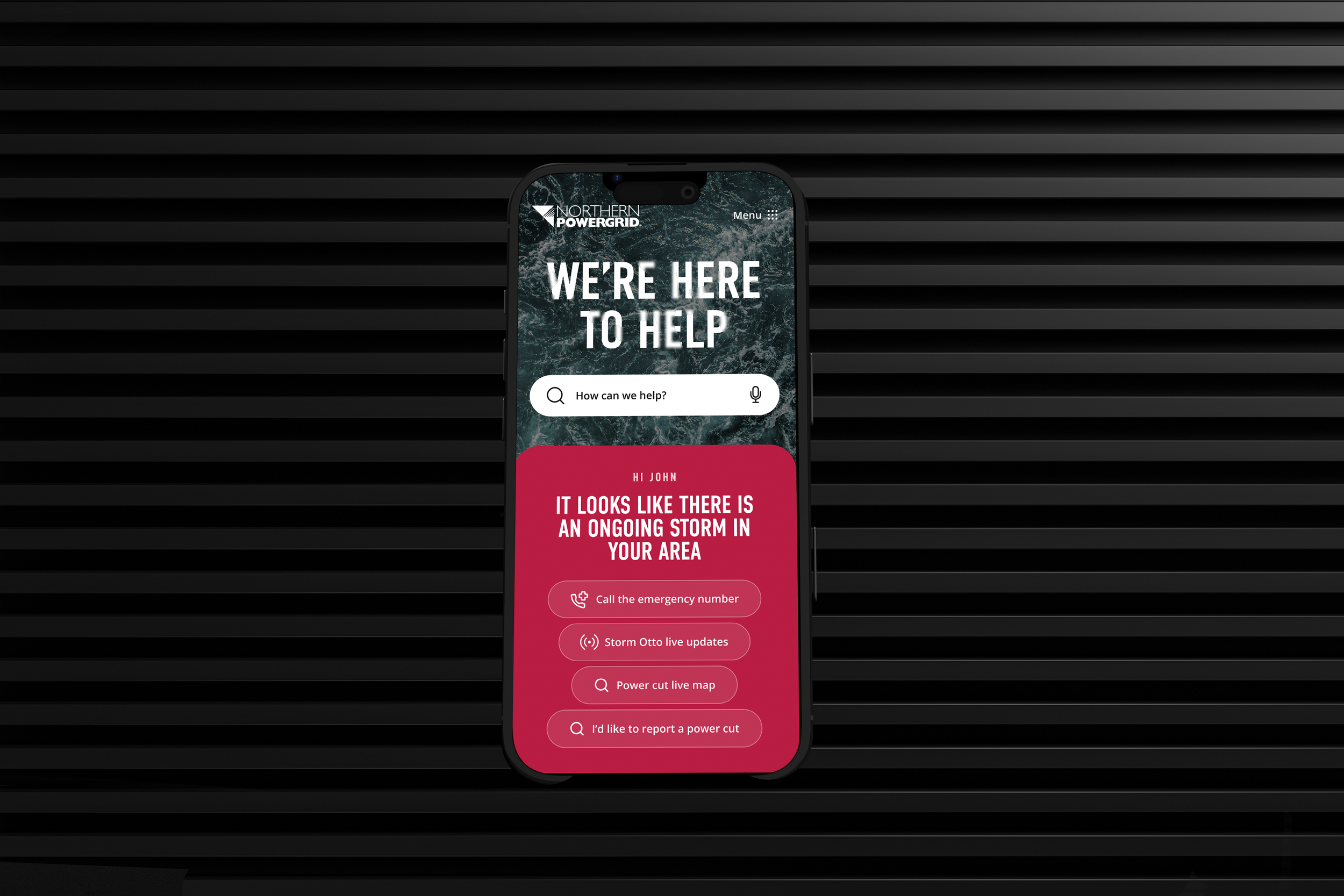
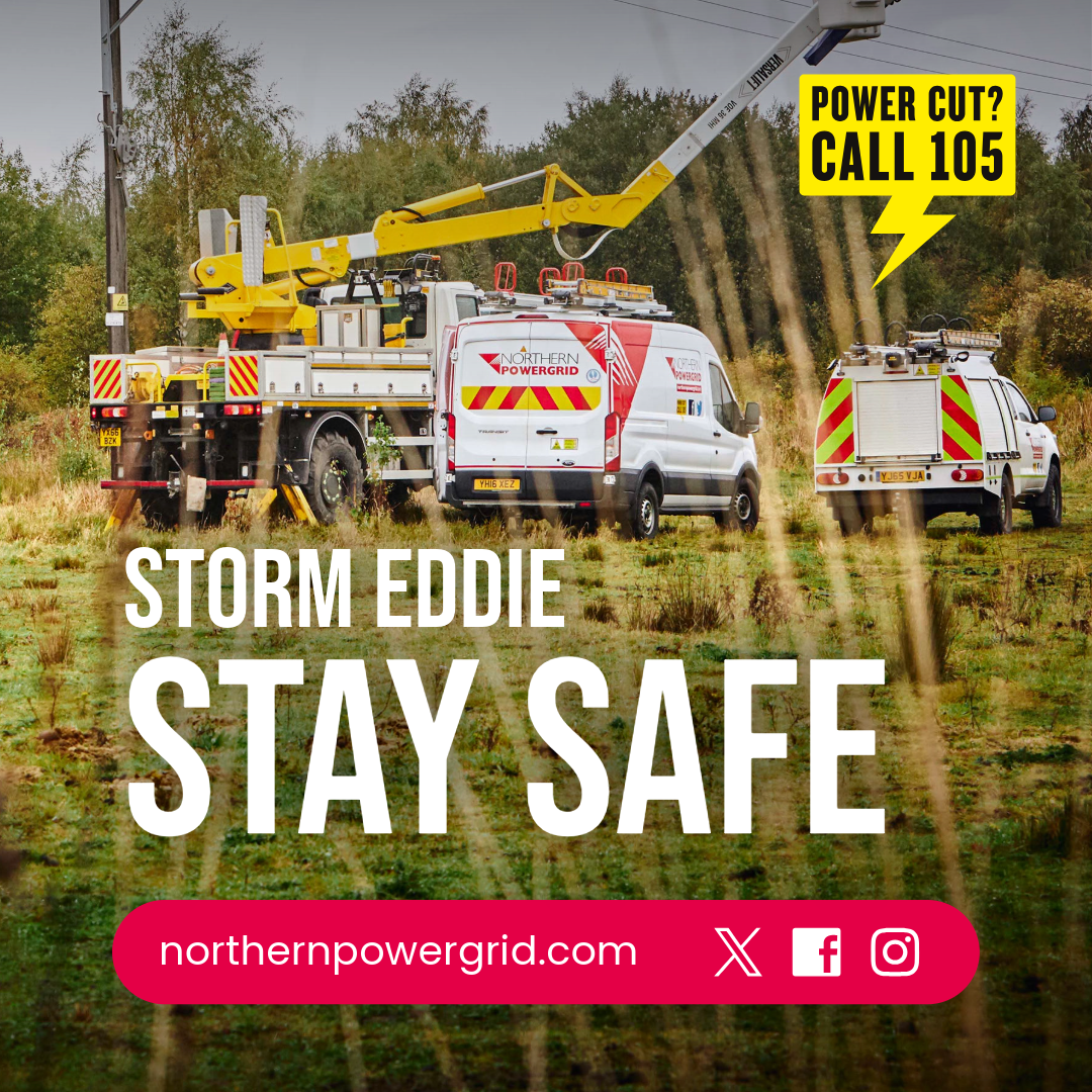
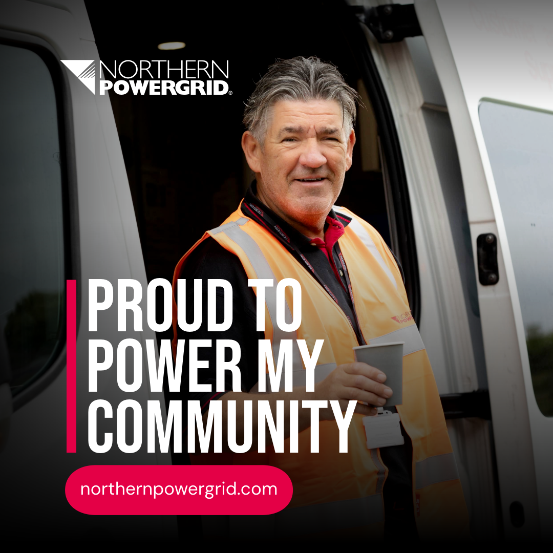
Using these insights as a starting point, a simplified visual system was developed to unify the brand across all external communications. This included refining the colour palette, establishing a clear typographic hierarchy and defining layout principles that could be applied consistently across a wide range of materials.
The aim was to create a recognisable visual framework that allows Northern Powergrid to communicate clearly with customers while remaining flexible for different communication needs. By introducing consistent visual rules and structure, the brand appears more cohesive and easier for customers to recognise.


The Result.
A stronger, more visible, and trusted external identity seen by more than 8 million customers.
A stronger, more visible and trusted external identity seen by more than 8 million customers across the region.
The refreshed visual system improved brand recognition and helped build understanding of the essential work Northern Powergrid carries out behind the scenes.
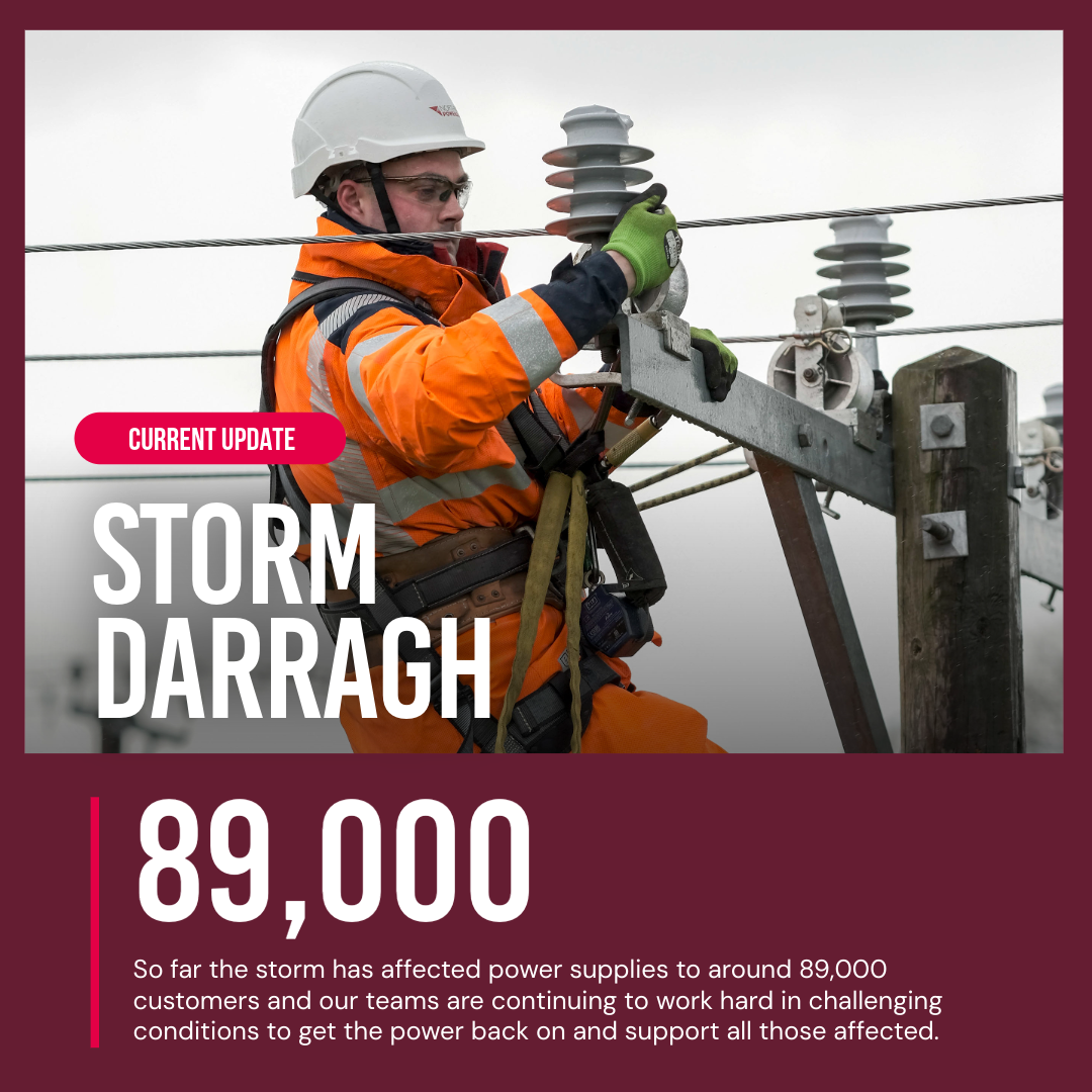
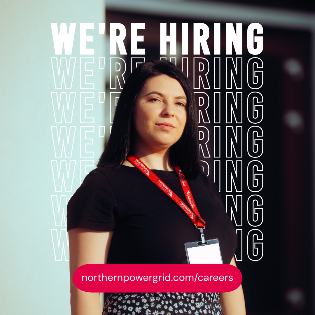
By introducing a more unified approach to colour, layout and tone, the brand now appears clearer and more consistent across customer letters, outage updates, public notices, digital screens and community communications. The external brand now reflects the scale and responsibility of the organisation, giving Northern Powergrid a confident and recognisable voice across the region.