
northern powergrid
Brand Strategy • Visual Identity • Brand Development • Digital & Print Design • Art Direction
What I Did
Web Launch
Brand Development
Creative Direction
Design Systems
Visual Rollout
The Brief.
A unified external brand designed for clarity, visibility, and public trust.
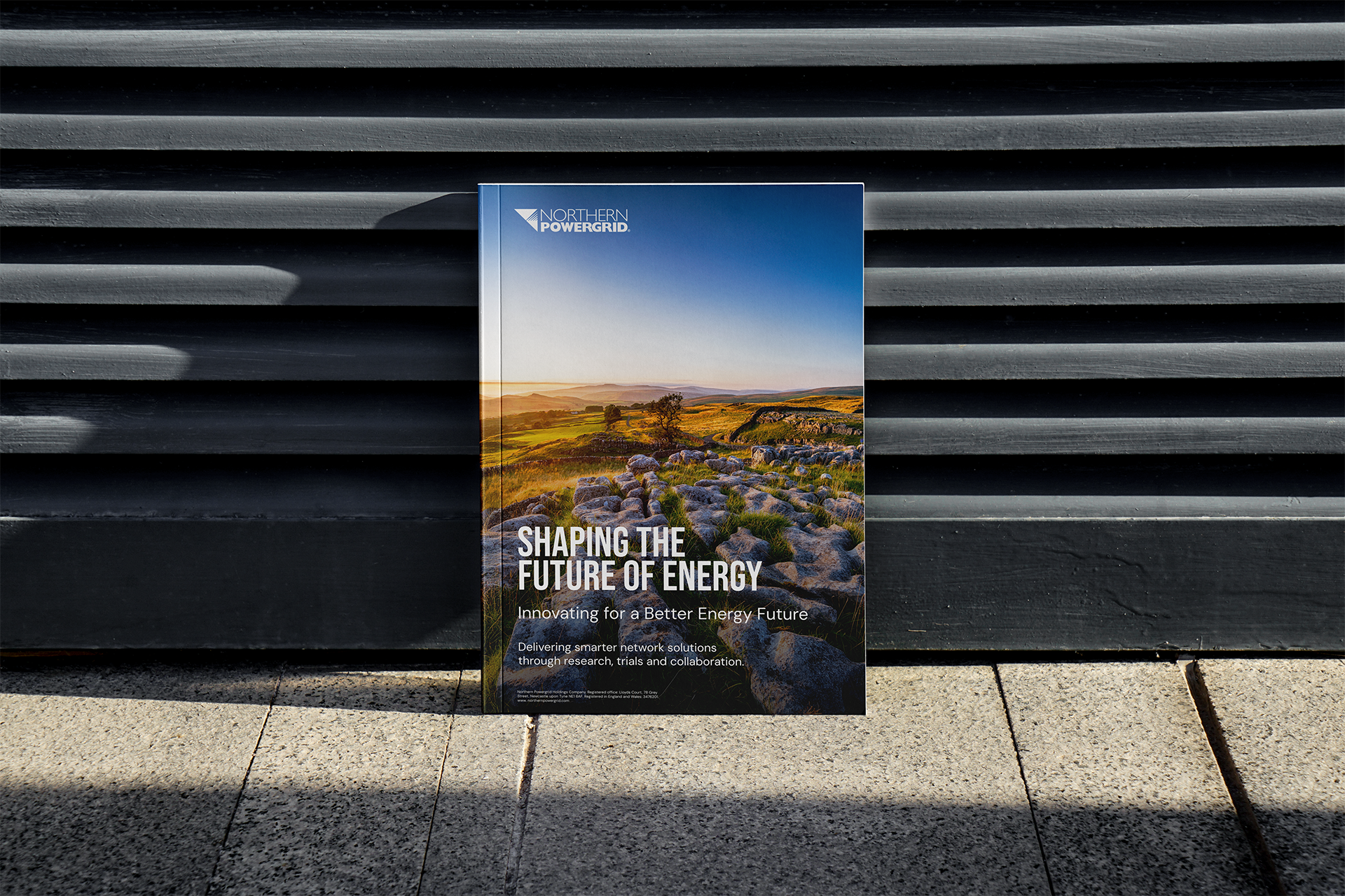
Brand Development & Guidelines
Client: Northern Powergrid
Role: Lead Designer / Art Director
View the website
www.northernpowergrid.com
Northern Powergrid needed a clear external brand identity that reached and resonated with more than 8 million customers across the North East, Yorkshire, and northern Lincolnshire.
The existing visual style was inconsistent and confusing, with ten different versions of red, multiple type styles, and no clear guidance. As a result, customers did not recognise the brand.
The business needed a strong, confident campaign that brought the brand to life and helped customers better understand the essential work Northern Powergrid delivers.
The Idea.
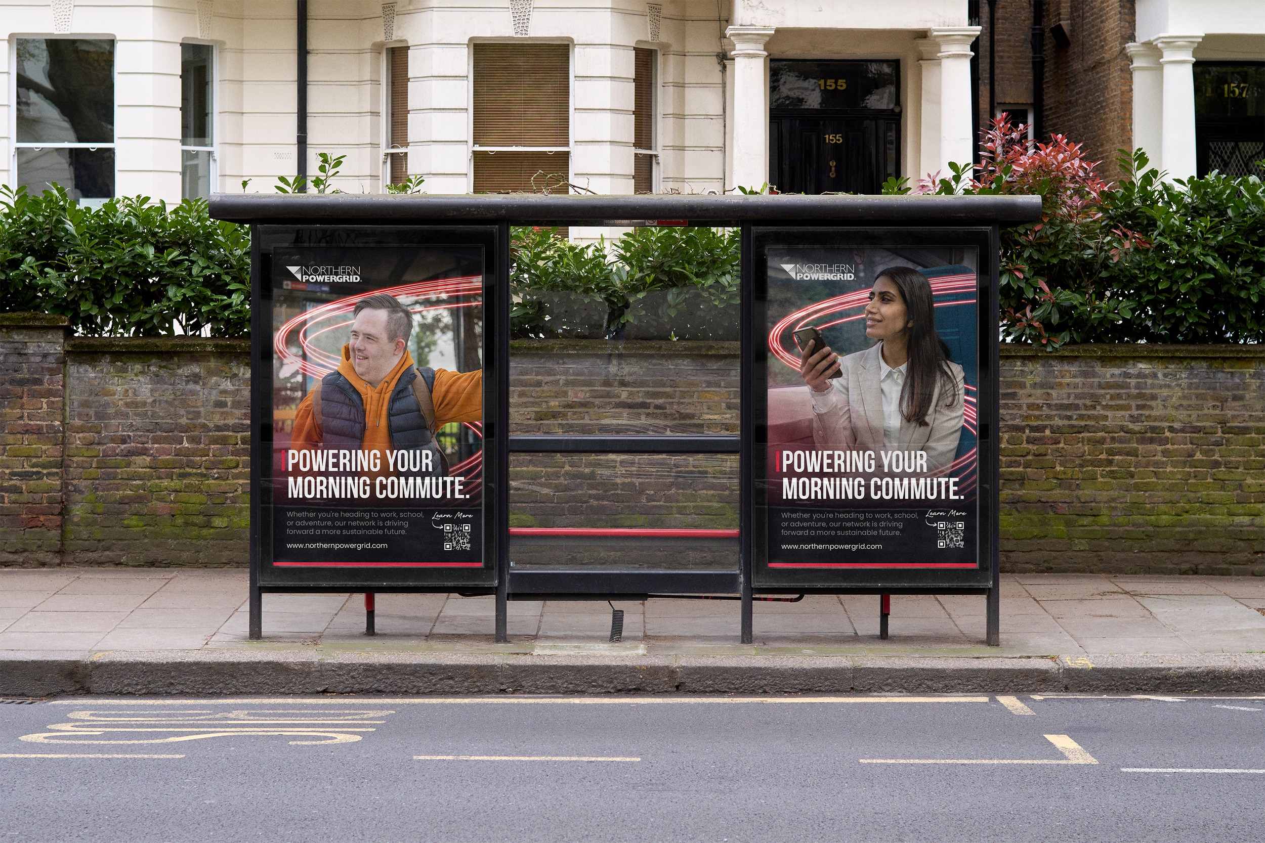
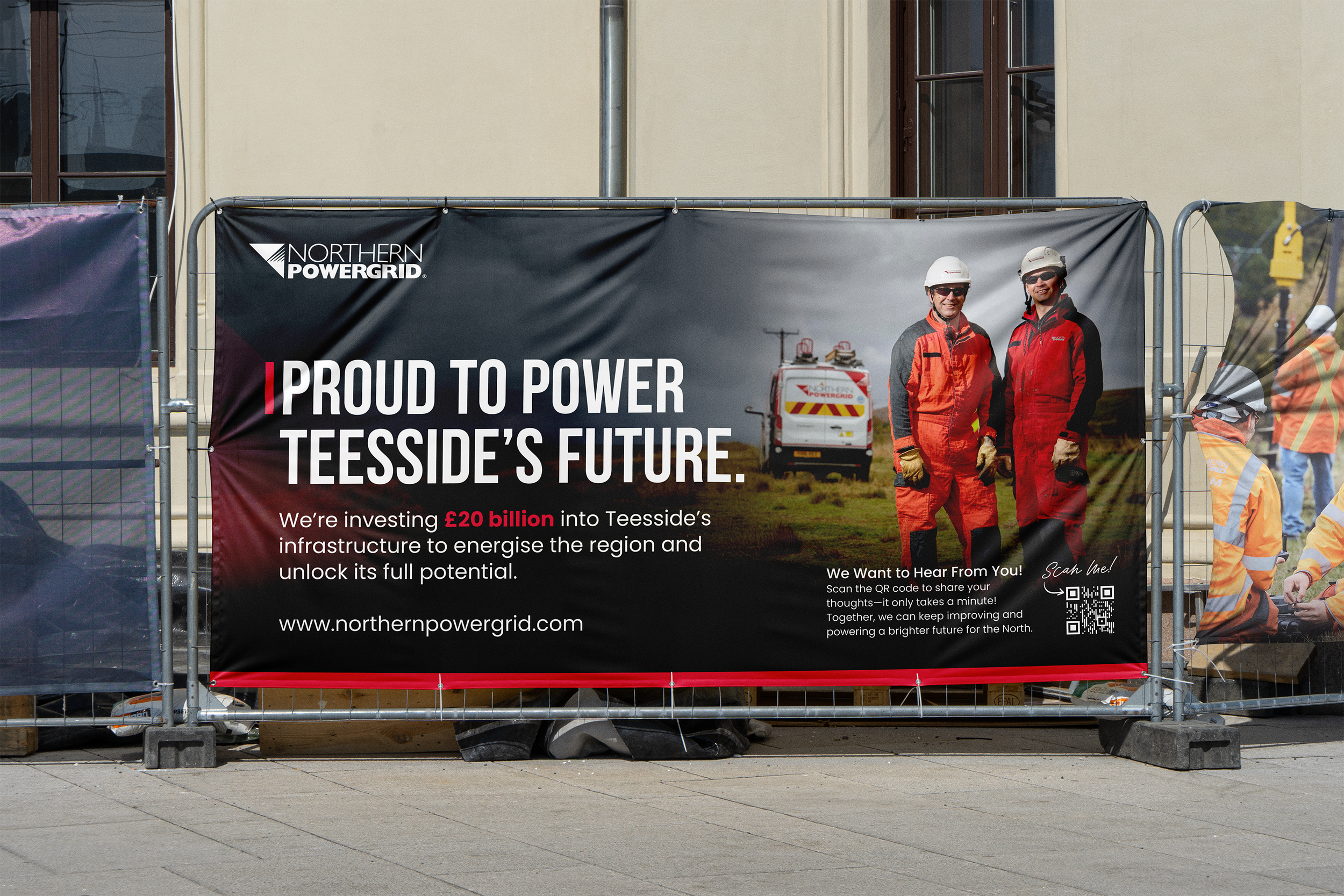
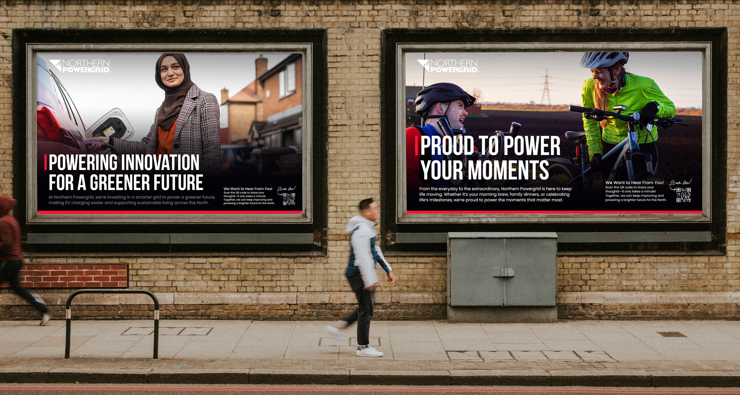
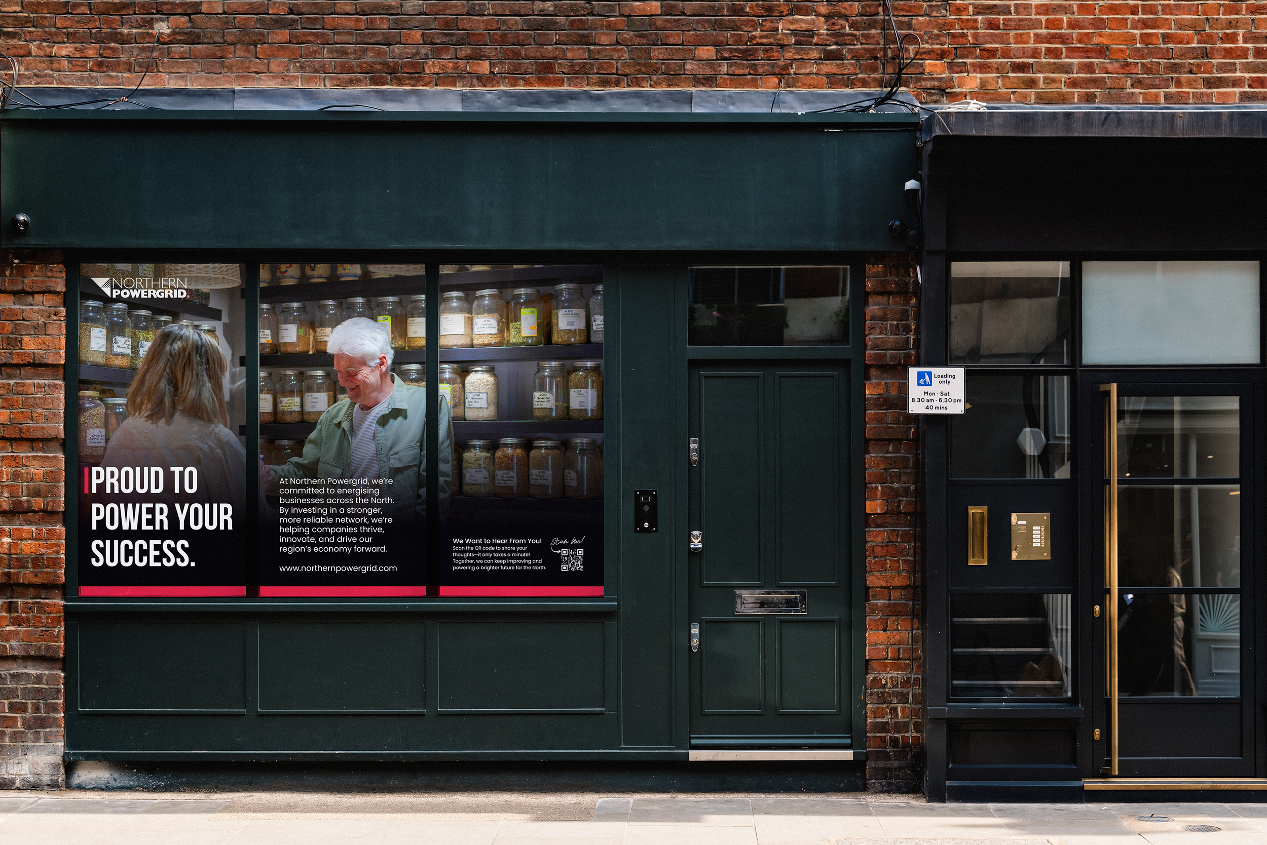
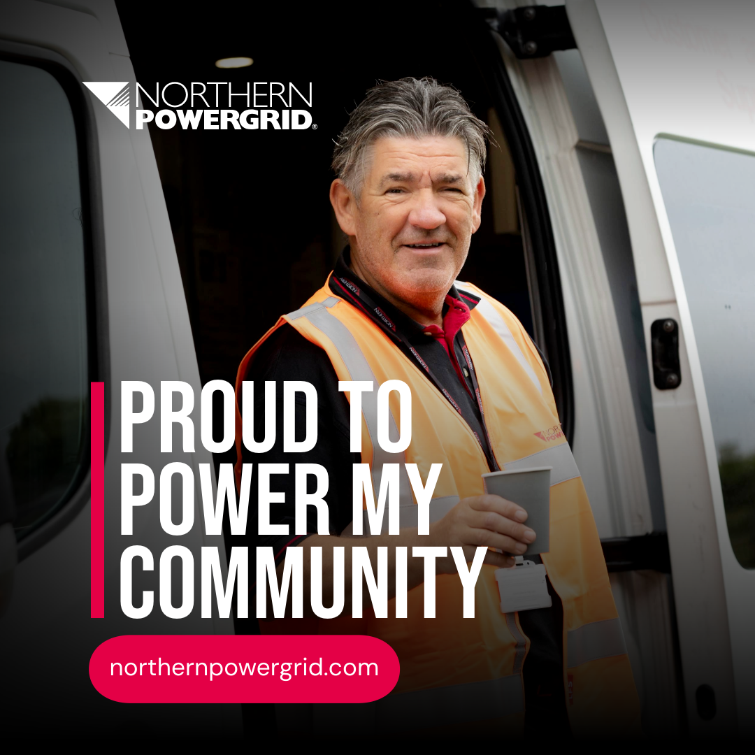
“Proud to Power”
Create a bold and recognisable identity that celebrates the essential services Northern Powergrid provides every day.
Use a single, confident red, stronger typography, and a clean visual language to make the brand instantly identifiable to the millions of customers who rely on it. The idea placed pride, service, and community at the heart of the brand.
The Execution.
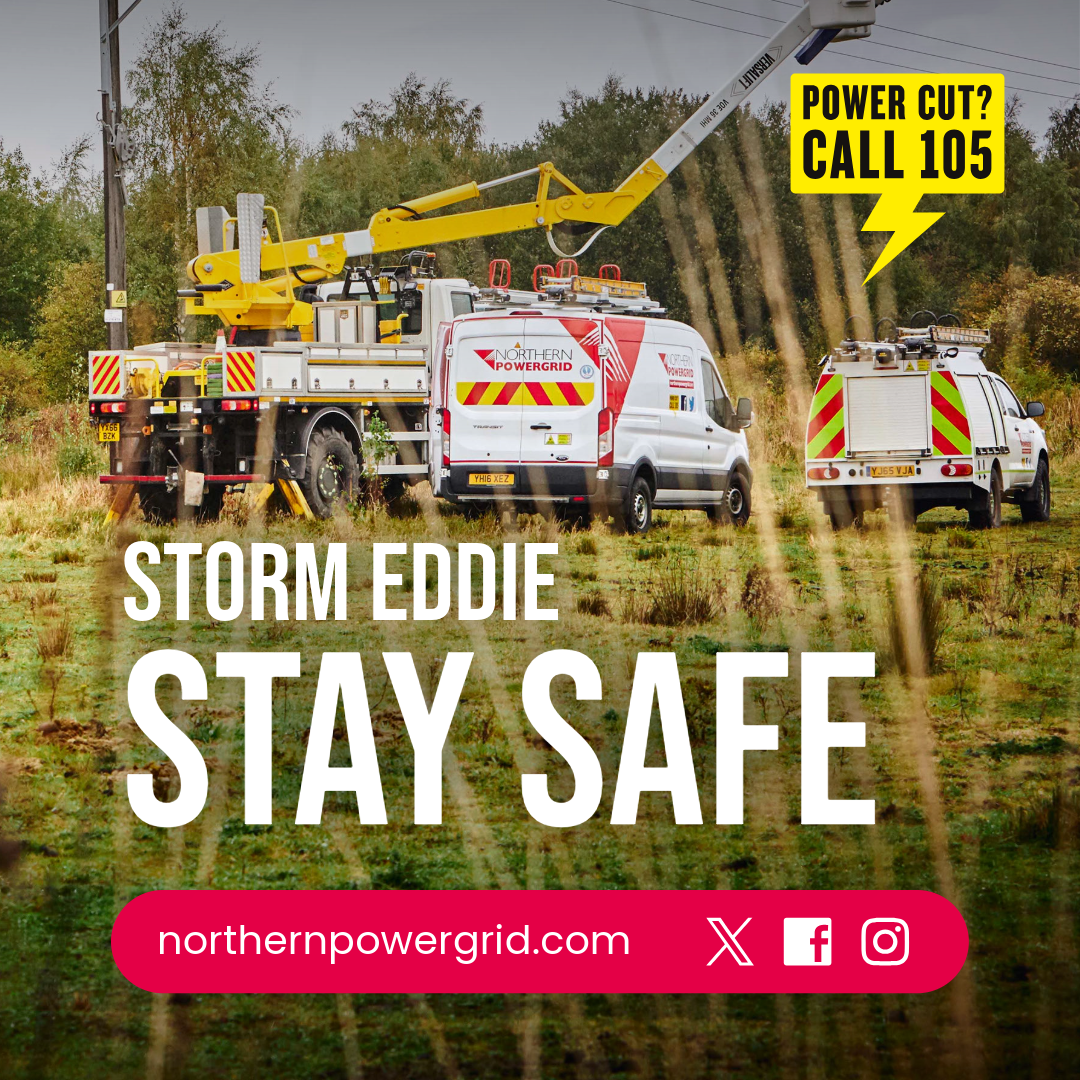
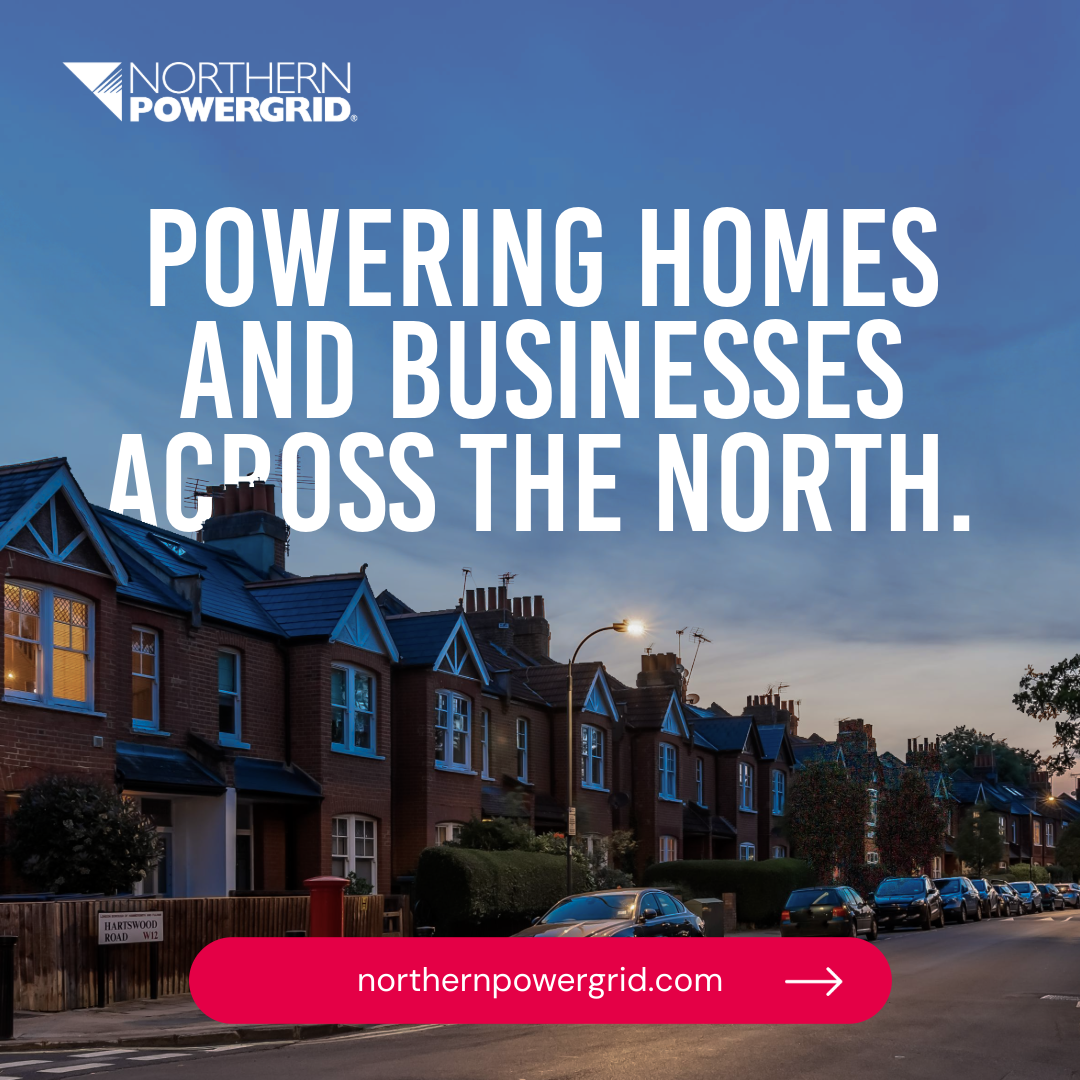
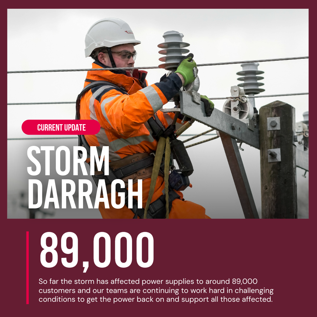
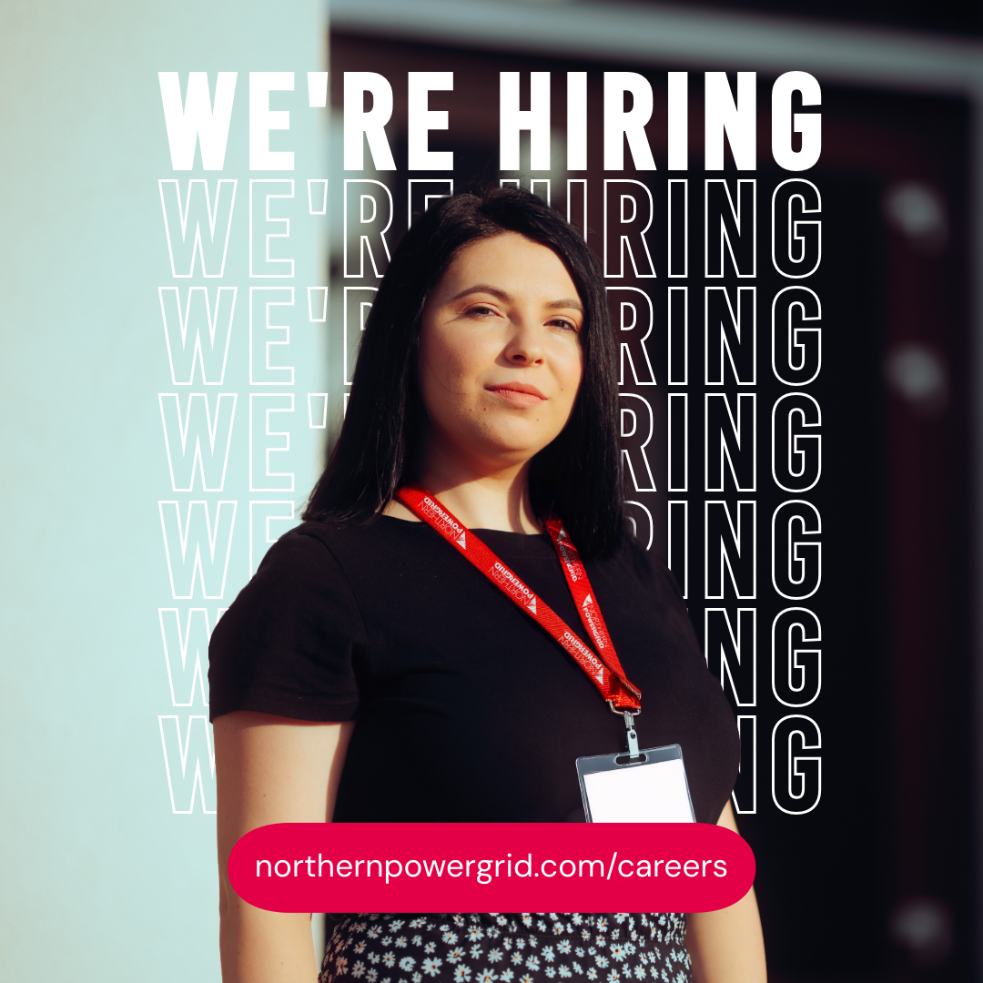
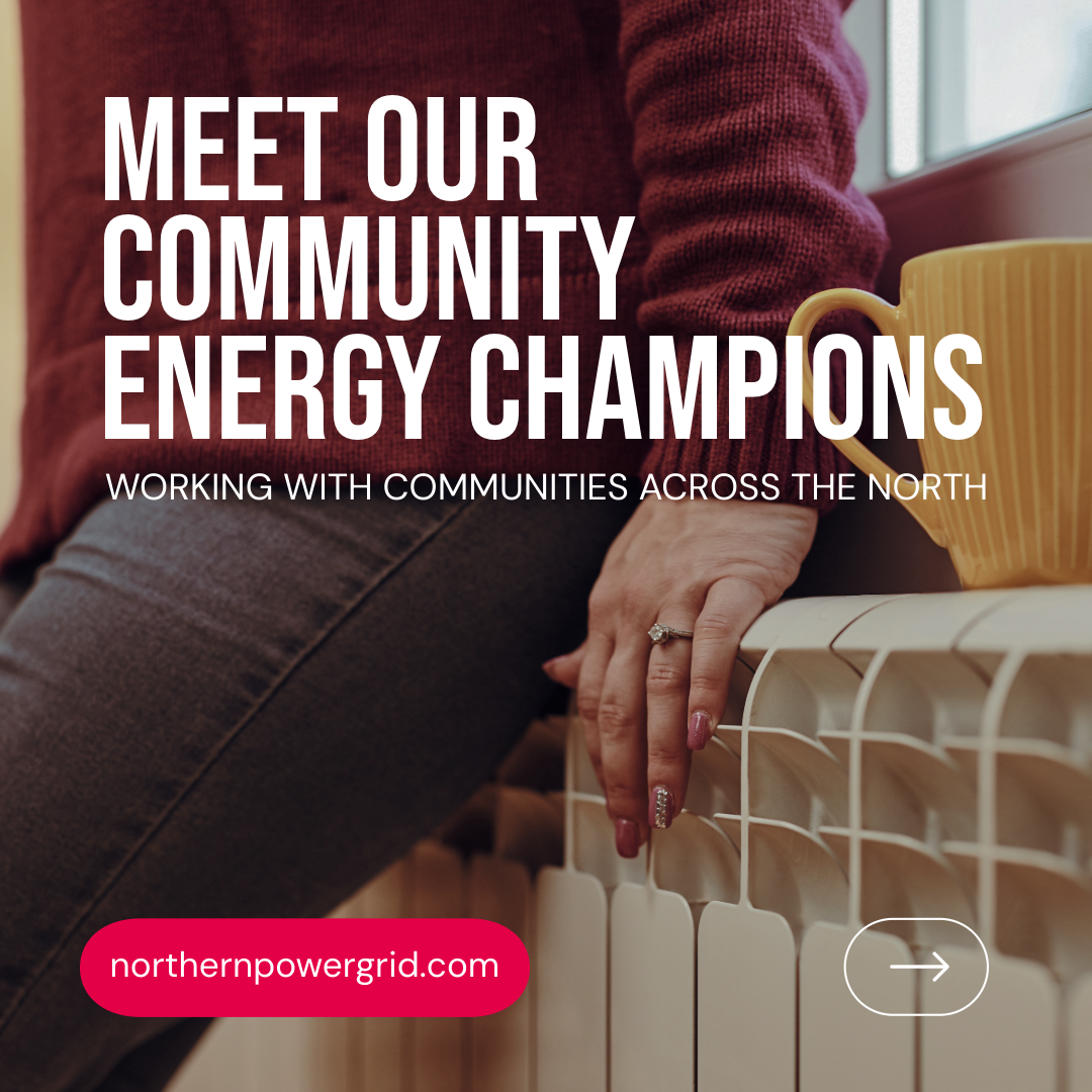
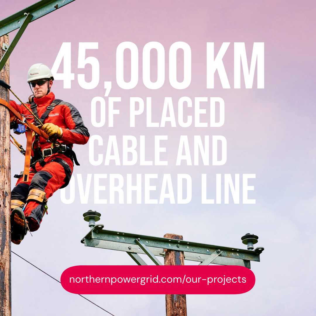
I unified the brand with one primary red, a supporting palette, and clear typographic/layout rules. This evolved into the Proud to Power campaign—bold headlines, strong design, and authentic photography to showcase the company’s role in connecting communities. The campaign ran across customer communications, digital, print, outdoor, and public touchpoints, ensuring regional consistency. I also produced practical design guidance for teams and suppliers.


The Result.
A stronger, more visible, and trusted external identity seen by more than 8 million customers.
The new refresh improved recognition and helped build understanding of the essential work Northern Powergrid delivers behind the scenes. The unified colour, layout, and tone created a clearer brand presence across customer letters, outage updates, public notices, digital screens, and community communication.
The external brand now reflects the scale and responsibility of the organisation, giving it a confident and consistent voice across the region.