
Bristows of Devon
Visual Identity • Print & Digital Design
What I Did
Packaging Design
Brand Application
Visual Layout
Typography
Print Production
The Brief.
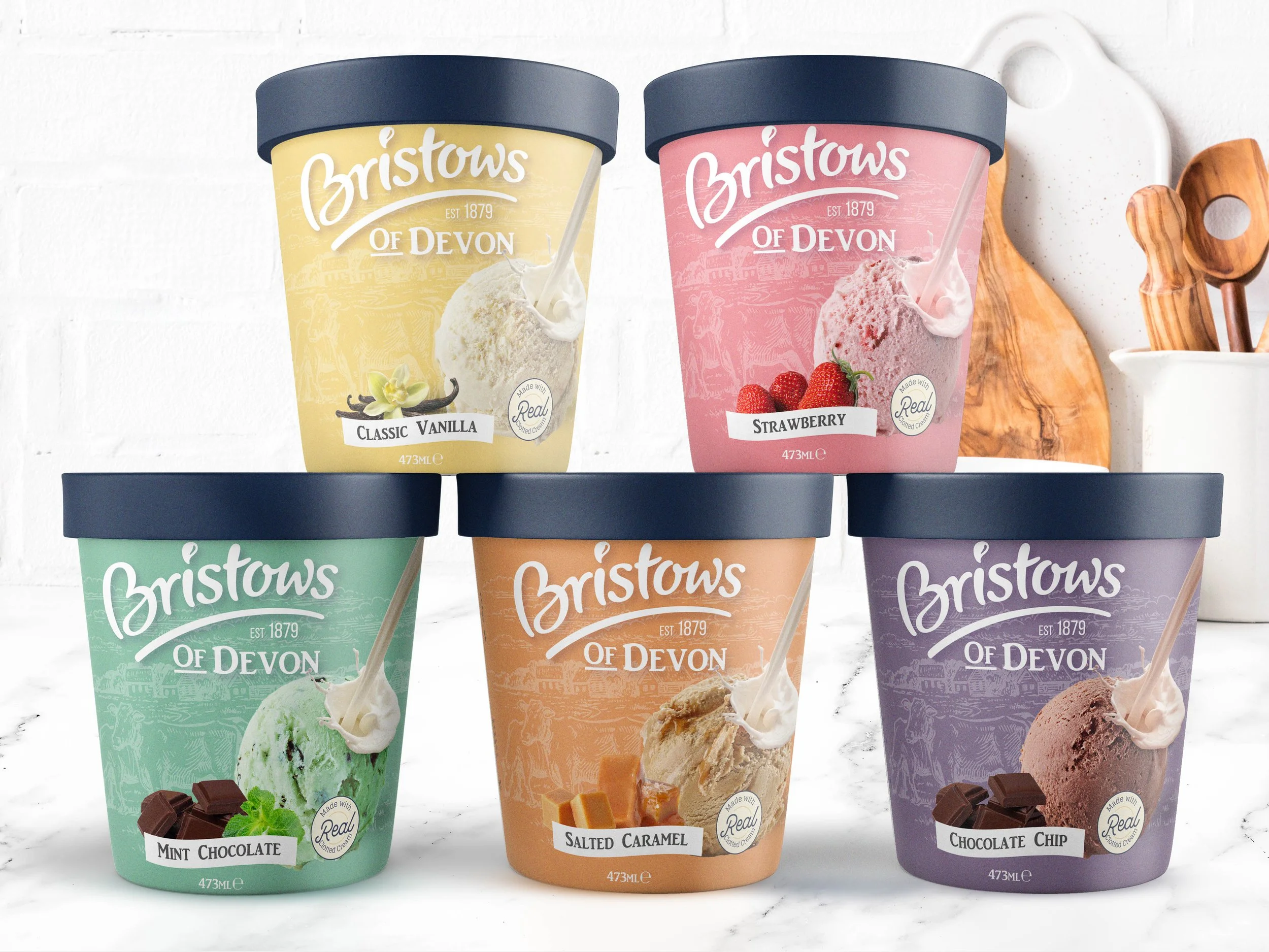
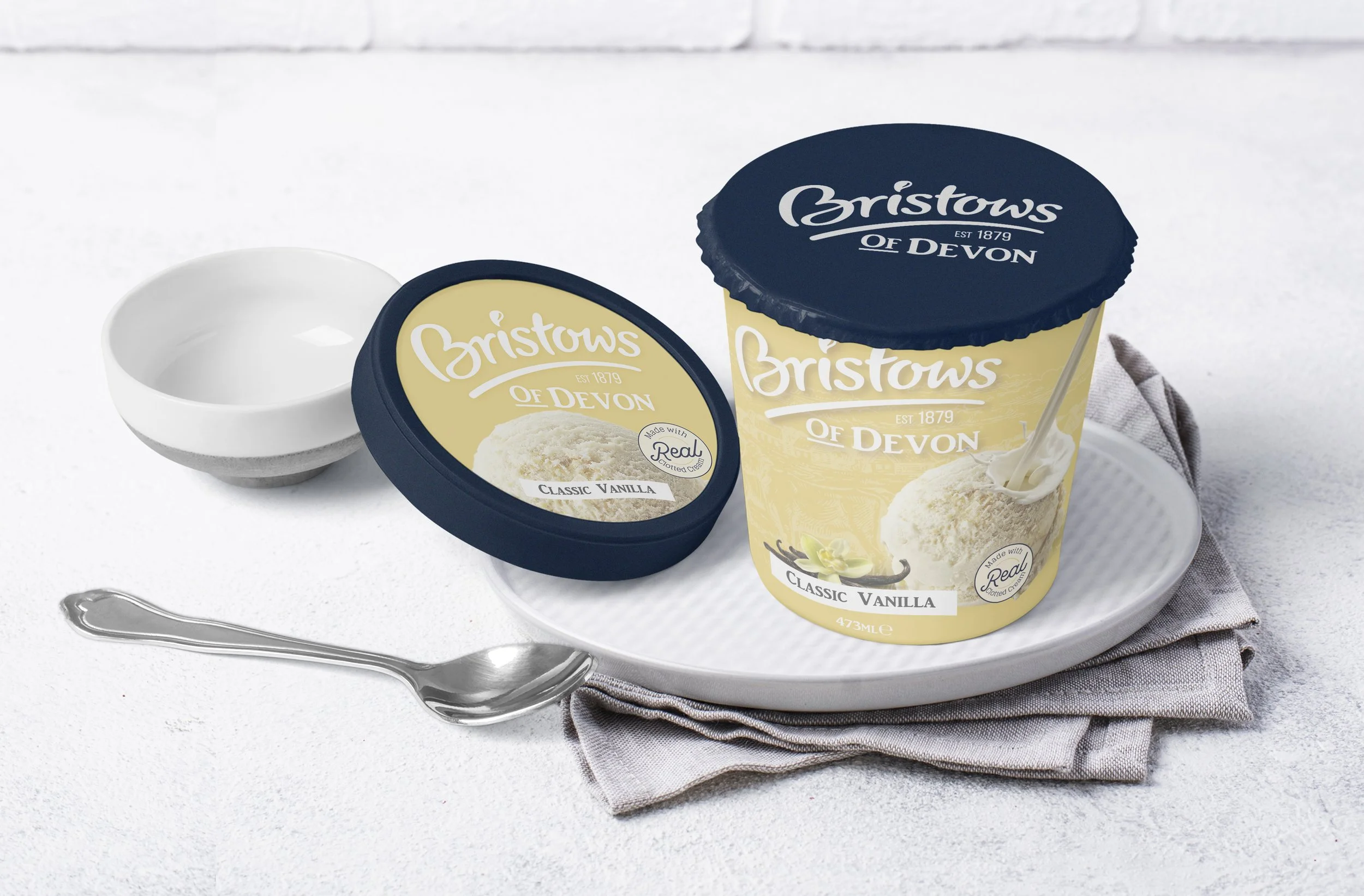
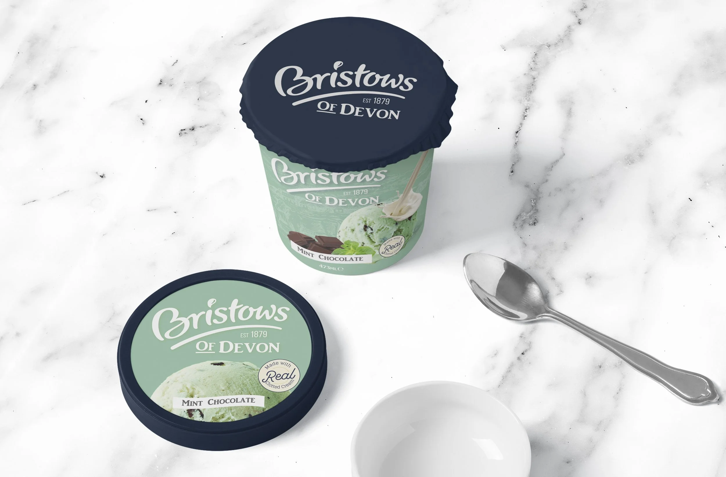
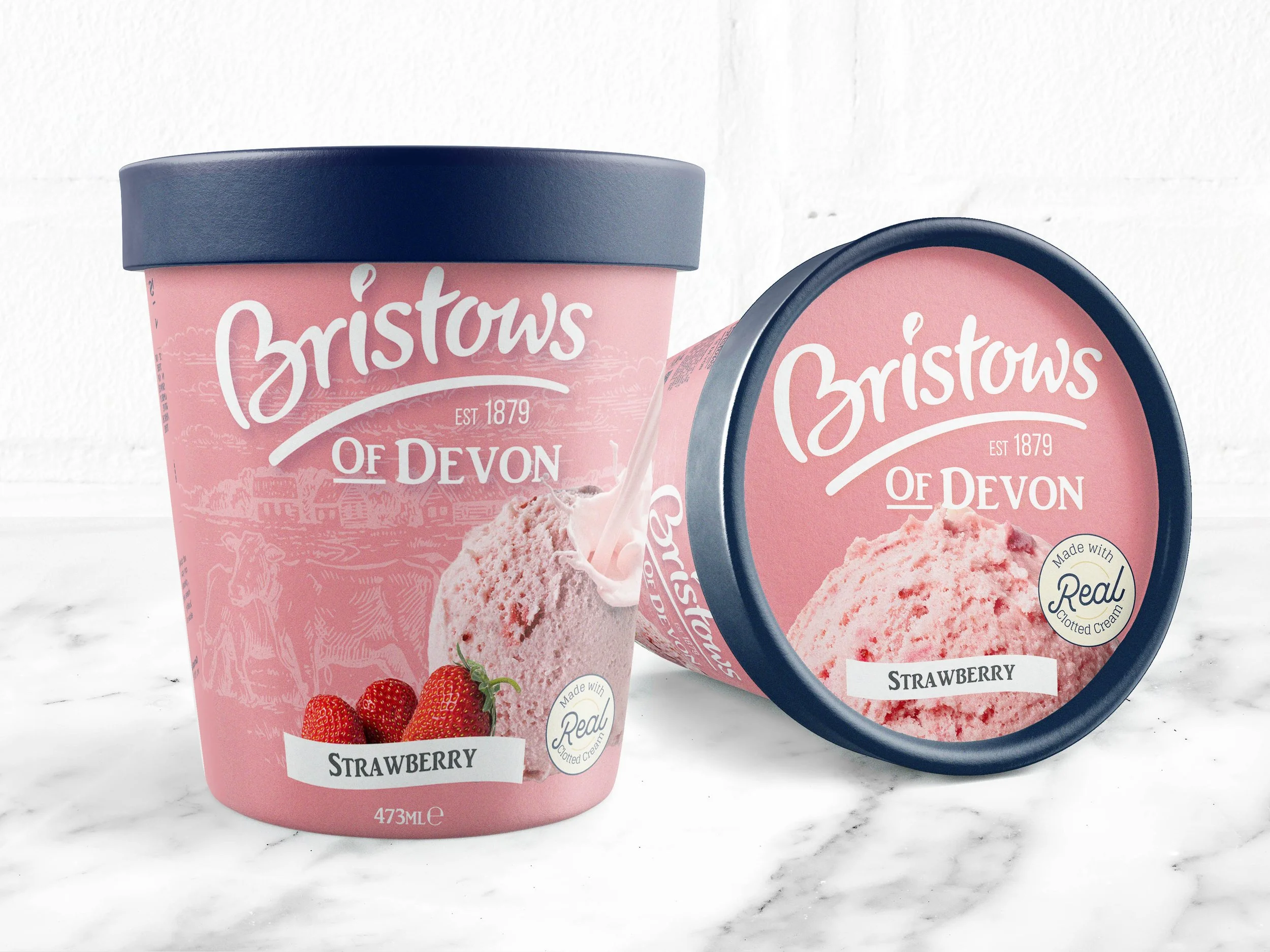
A heritage-inspired packaging design celebrating real clotted cream
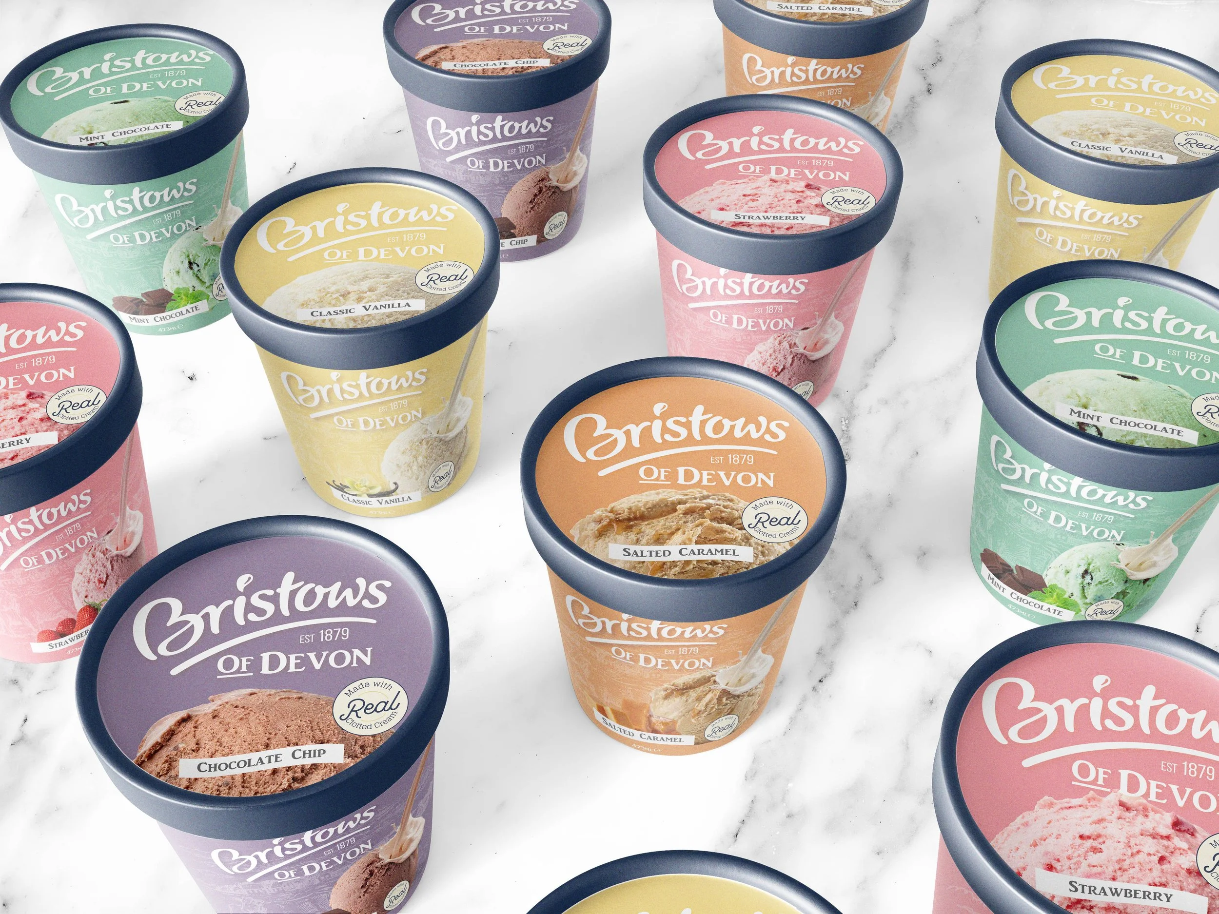
Packaging Designs
Client: Great British Confectionery Co.
Role: Lead Designer
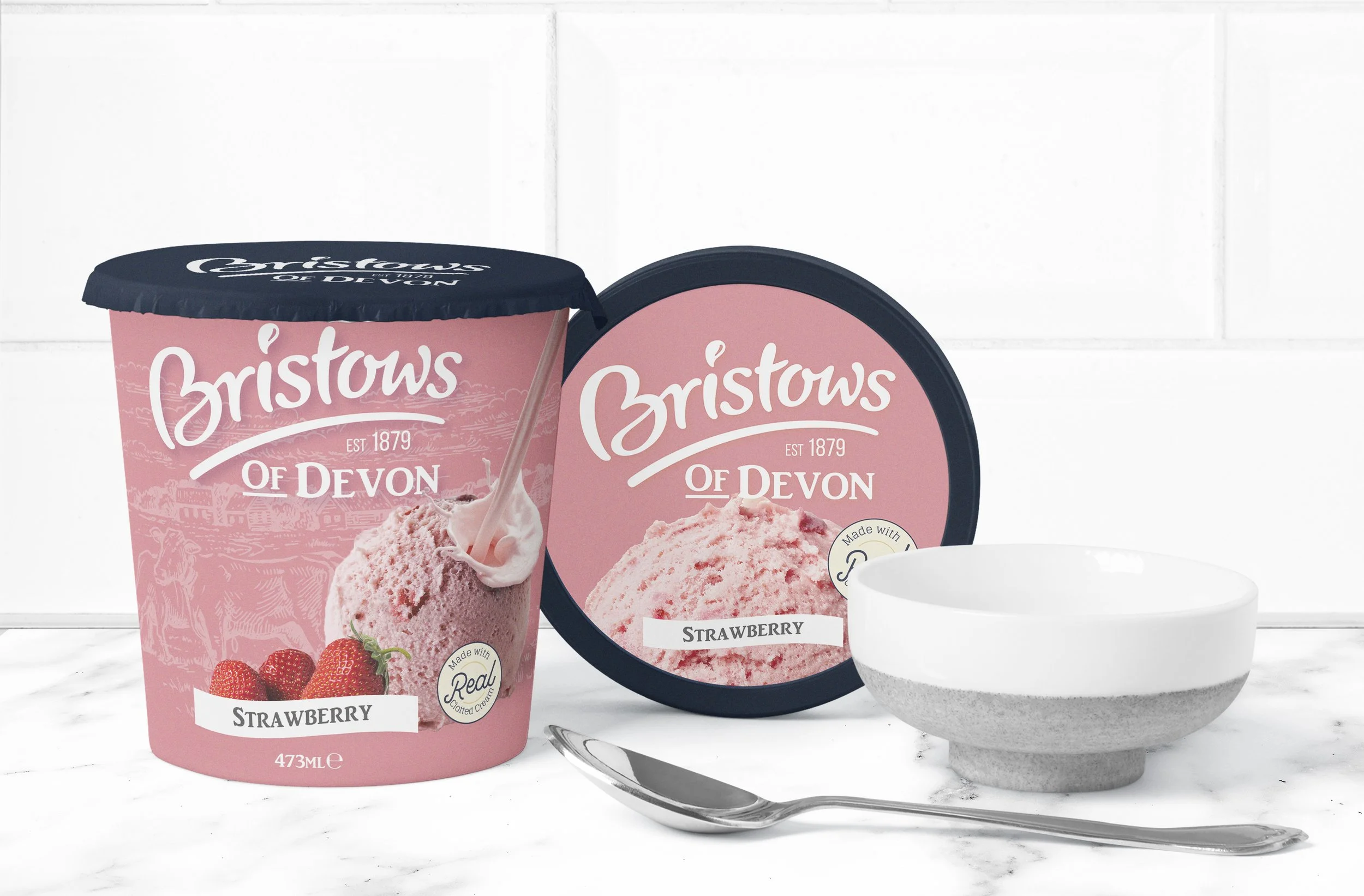
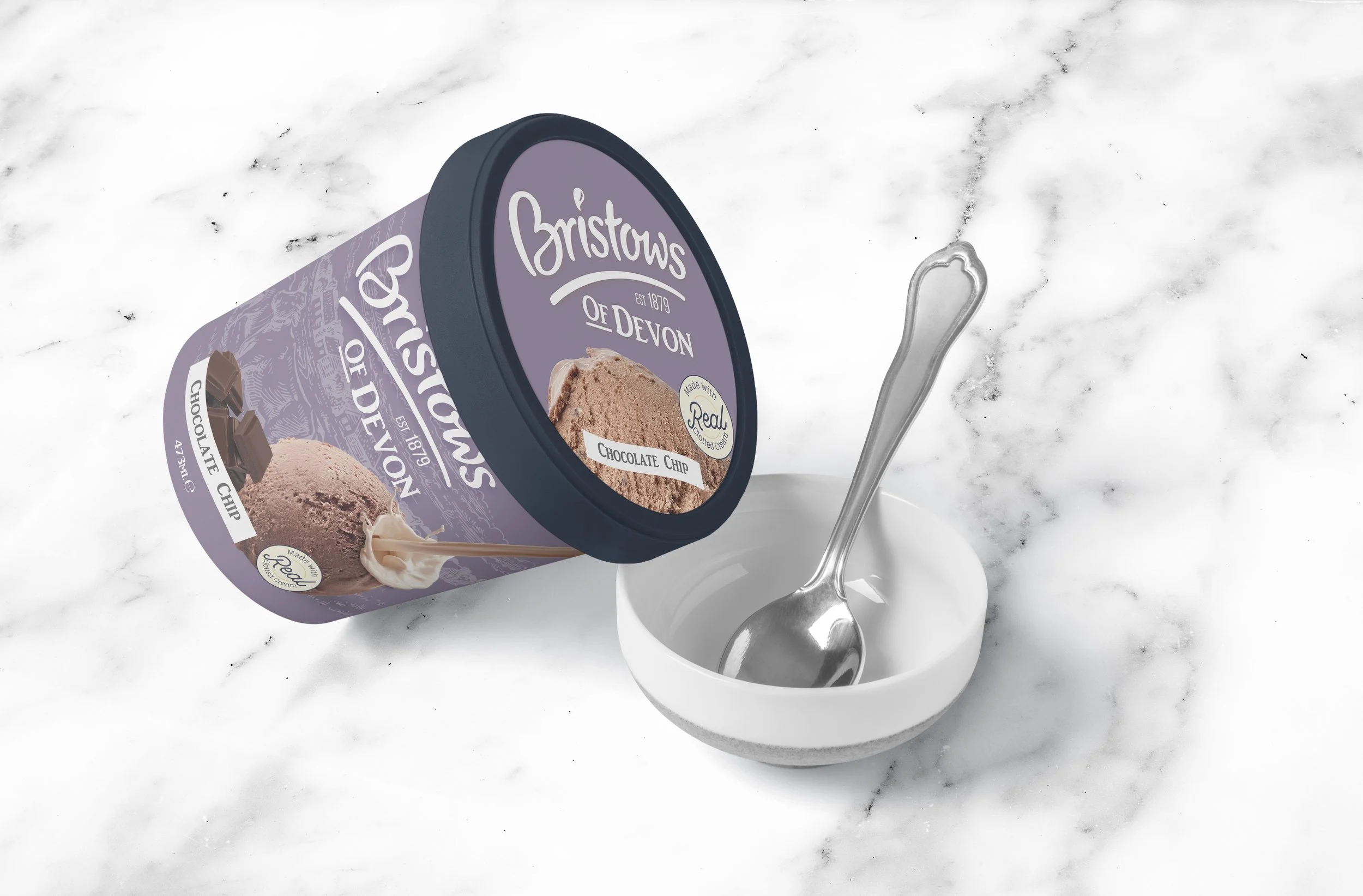
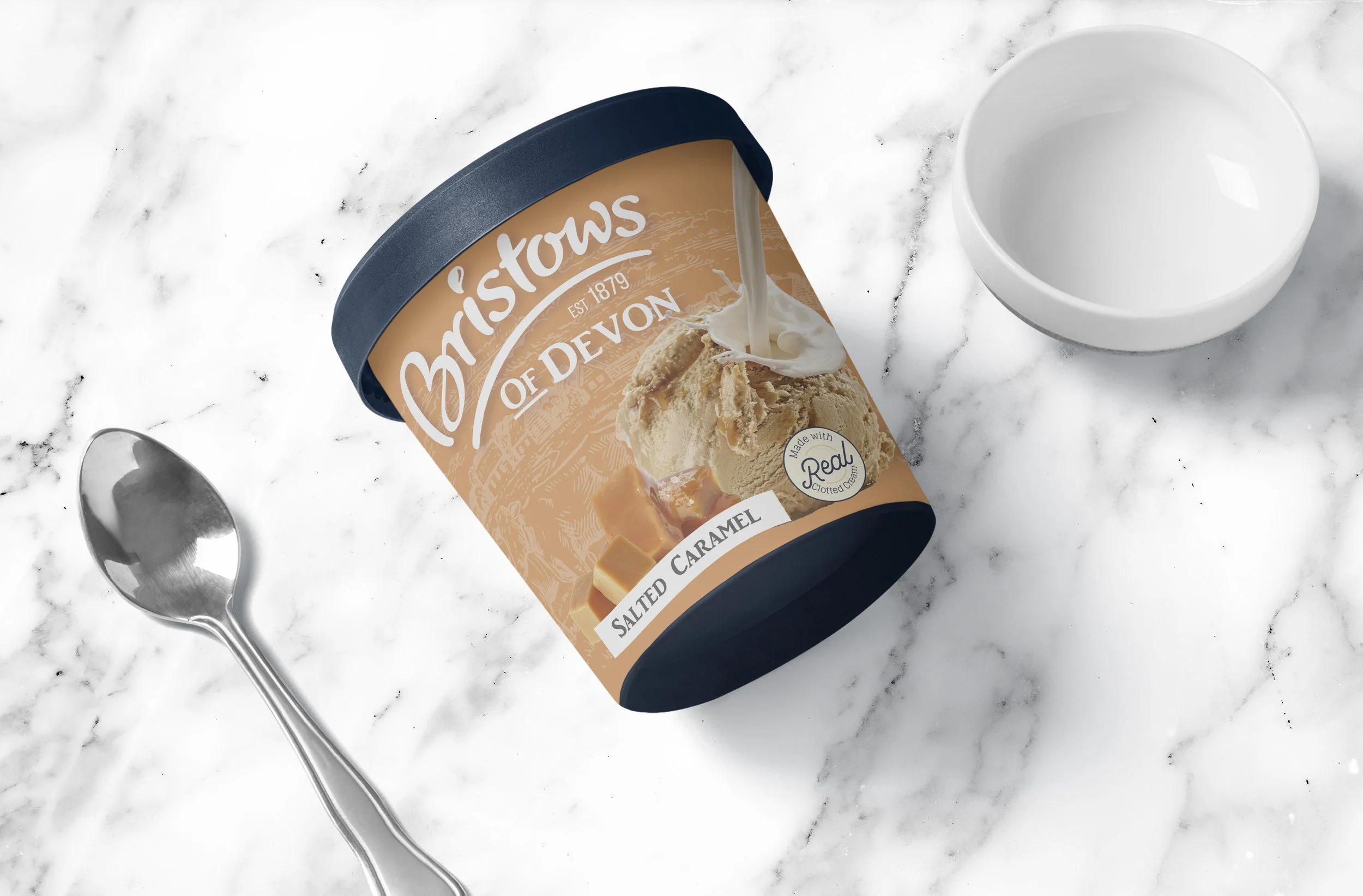
Bristow’s Ice Cream required packaging that could stand out within busy supermarket freezers while highlighting one of its most important ingredients, real clotted cream.
The challenge was to create a design that balanced heritage and authenticity with strong shelf presence in Tesco stores. The packaging needed to reflect the quality of the product while remaining clear, recognisable and visually appealing to modern shoppers.
The brief was to develop a packaging design that captured Bristow’s traditional roots while presenting the product in a way that felt fresh, premium and relevant within the retail environment.

The Approach
The creative direction focused on heritage, quality and strong shelf impact.
Typography, colour and layout were carefully considered to highlight the use of real clotted cream while reinforcing the brand’s traditional character. The aim was to create packaging that felt premium and authentic, while remaining clear and visually engaging in a competitive supermarket environment.
By balancing traditional cues with clean contemporary design, the packaging could communicate both quality and indulgence.
The Result.
A distinctive packaging design that brings together Bristow’s heritage with a modern retail presence.
The final design emphasises the use of real clotted cream while creating strong shelf visibility within Tesco stores. The packaging successfully blends traditional branding with a refined layout that feels both classic and contemporary.
The result is a product that feels authentic, premium and instantly recognisable on the shelf.