
ECO ENERGY
Rebrand • Print Design • Visual Direction • Brochure Design
What I Did
Brand Identity
Editorial Design
Storytelling
Print Design
Creative Direction
The Brief.
A natural, honest identity shaped around local energy stories.
Rebrand and Brochure Design
Client: Eco Energy Ltd
Role: Lead Designer and Project Manager
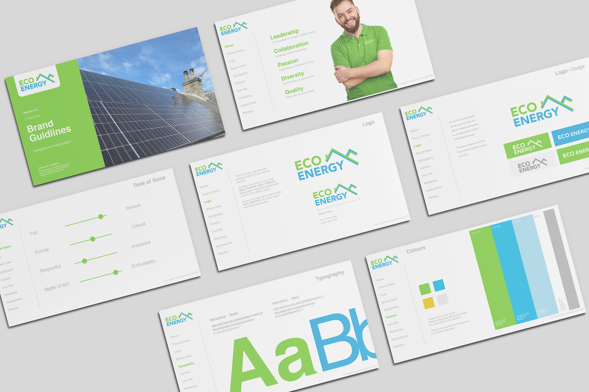
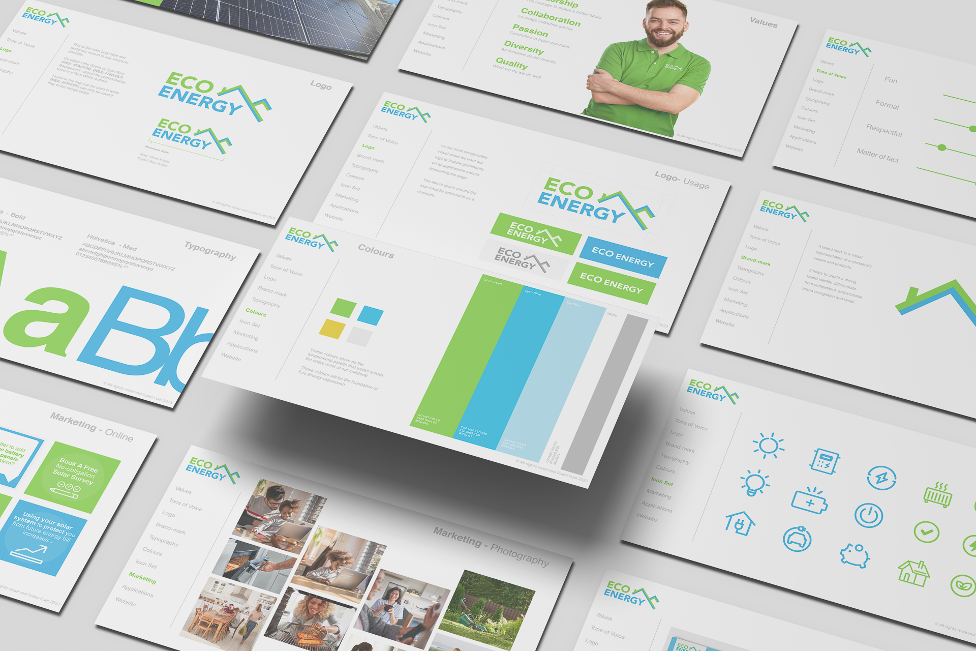
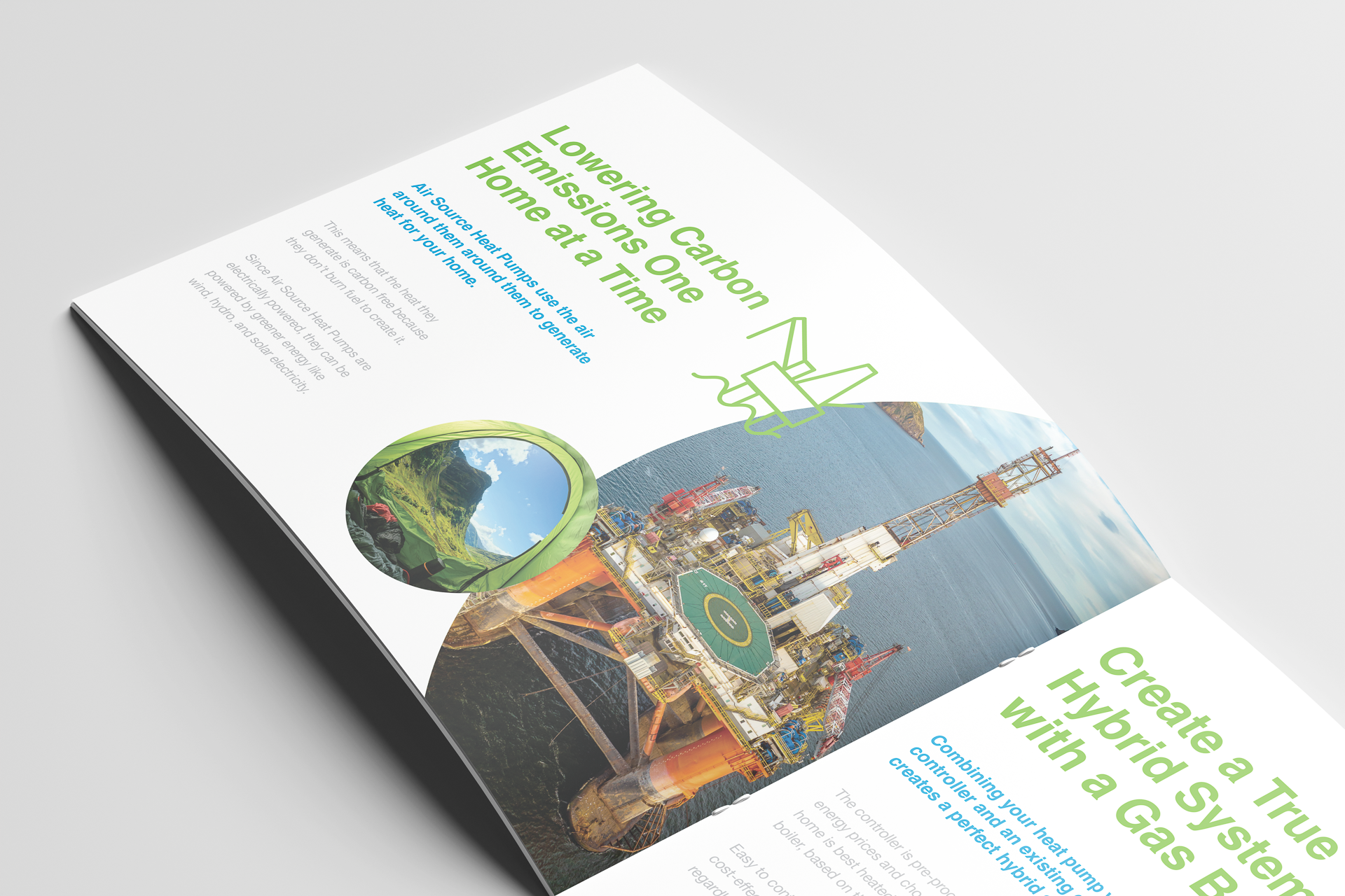
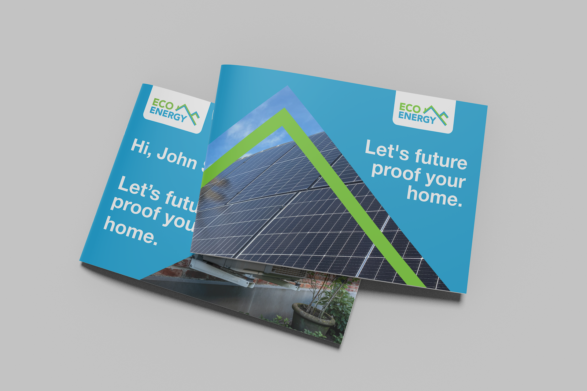
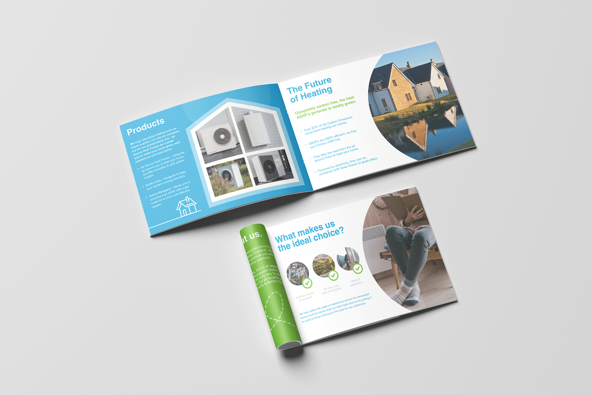
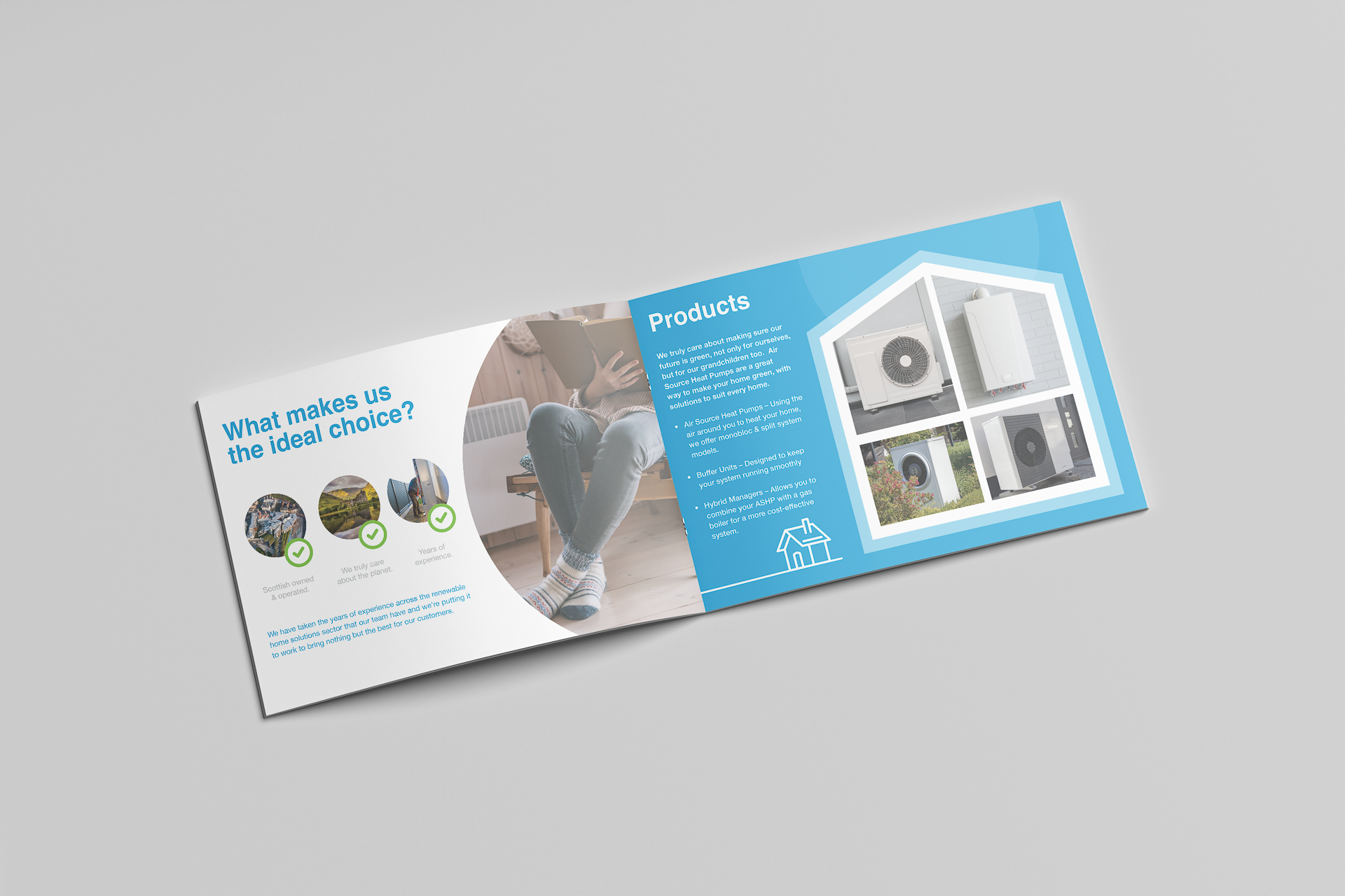
Eco Energy needed a refreshed identity that felt more aligned with the work they did and the communities they served. Their existing materials lacked warmth and authenticity and did not communicate the trust customers needed when choosing renewable installations. The business wanted a clearer, more grounded identity that reflected its sustainable values and strong connection to Scotland.
The Idea.
“Sustainability, designed locally.”
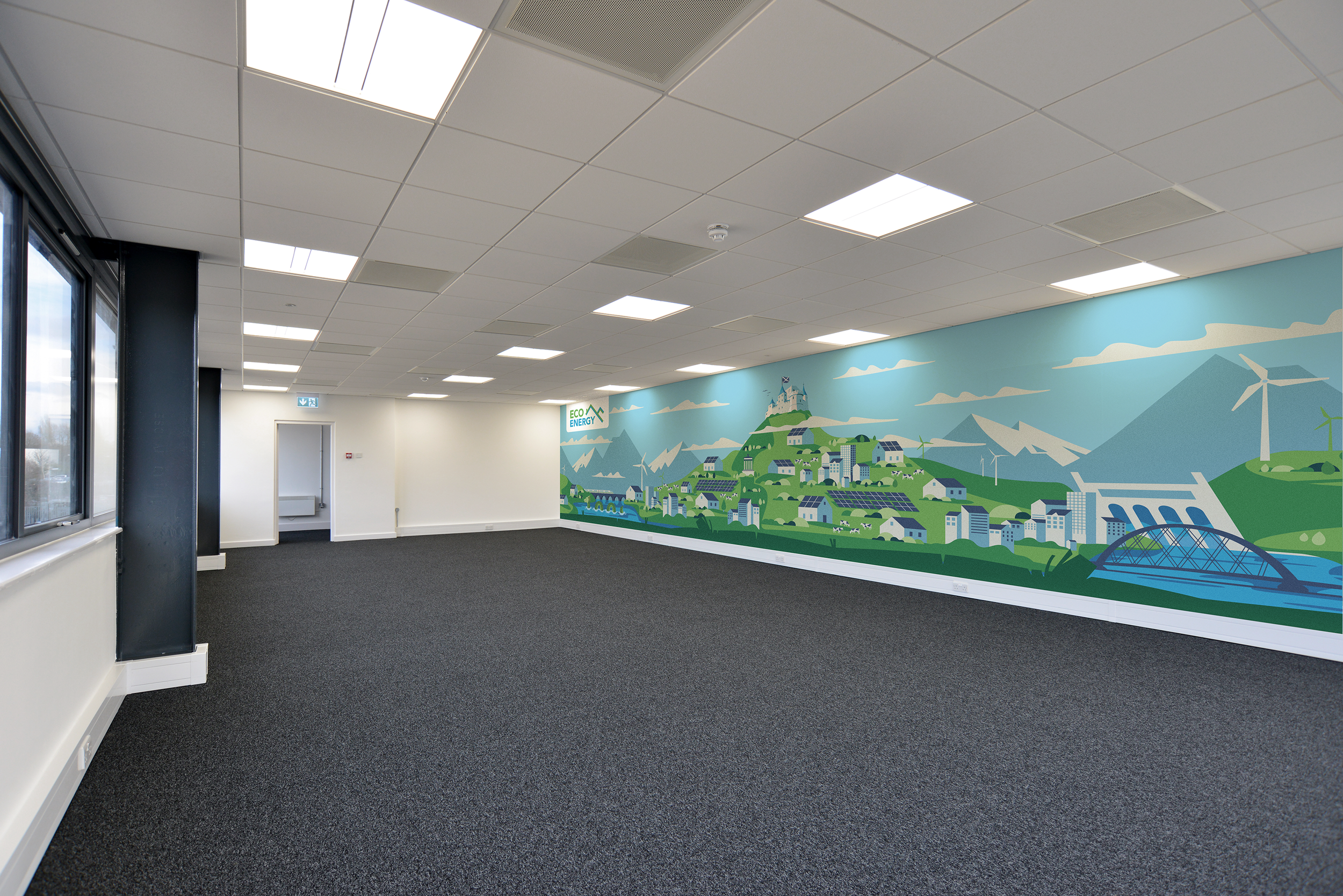
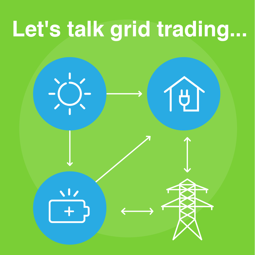
To create a visual direction inspired by real Scottish landscapes and the people behind each installation. Using strong eco colours, straightforward typography, and natural imagery to create a brand that feels grounded, reliable, and genuinely connected to the community. The identity needed to speak with clarity while still holding a sense of warmth and Scottish pride.


The Execution.
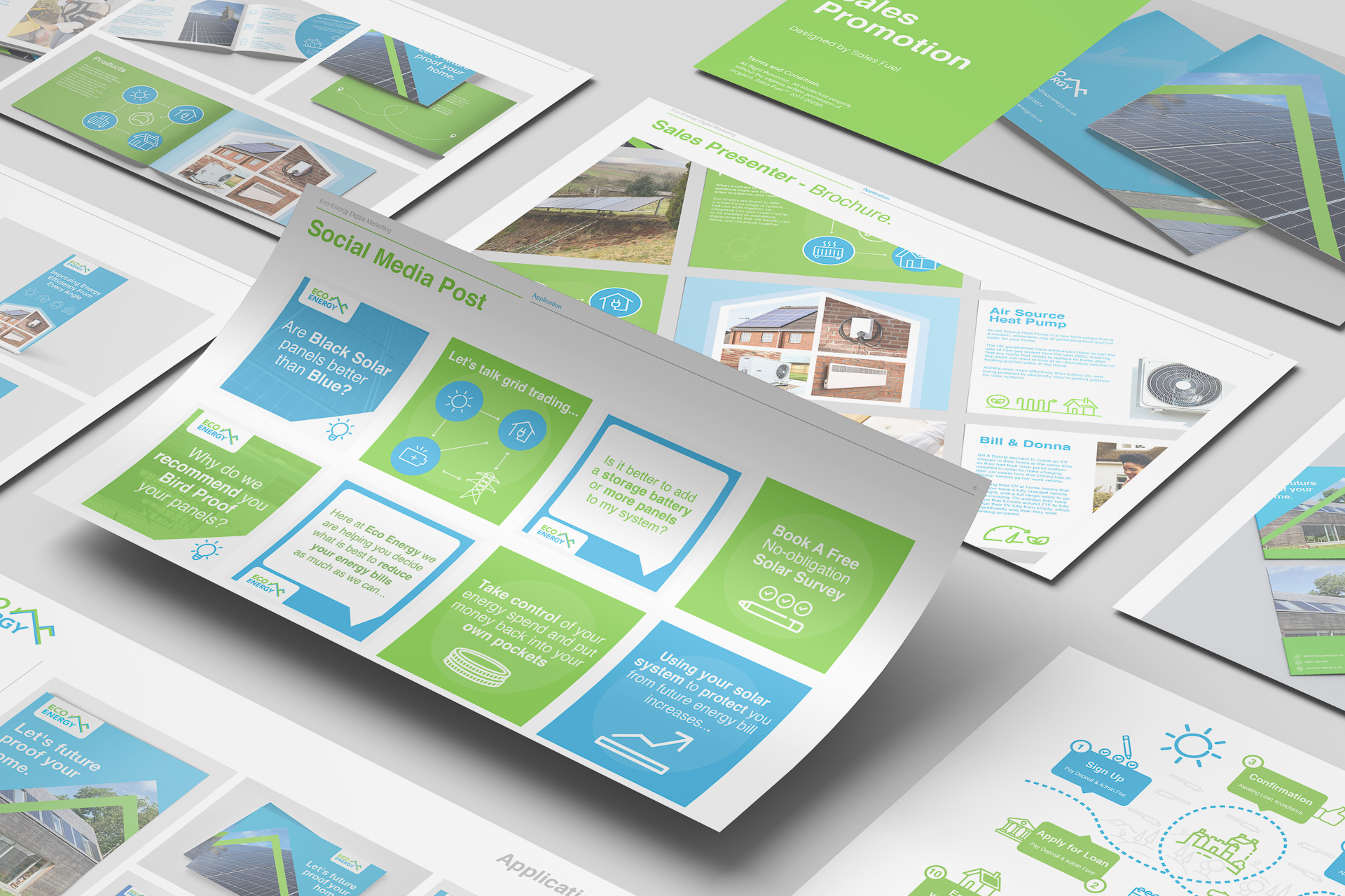
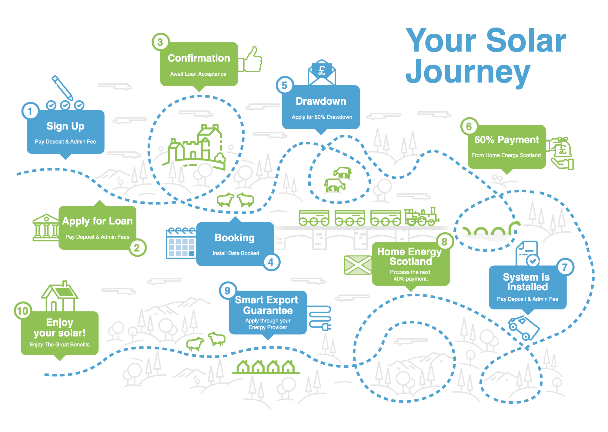
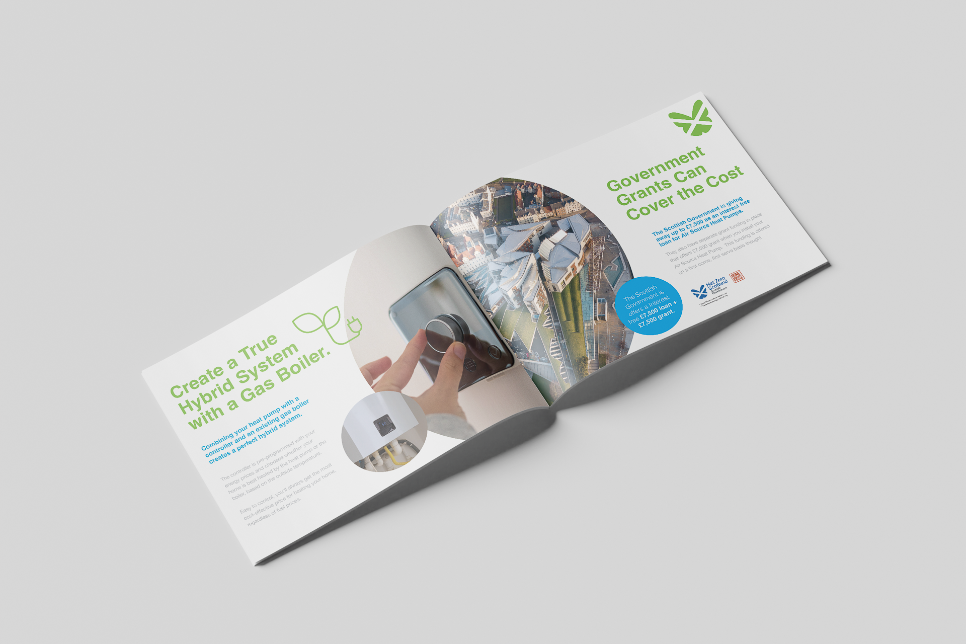
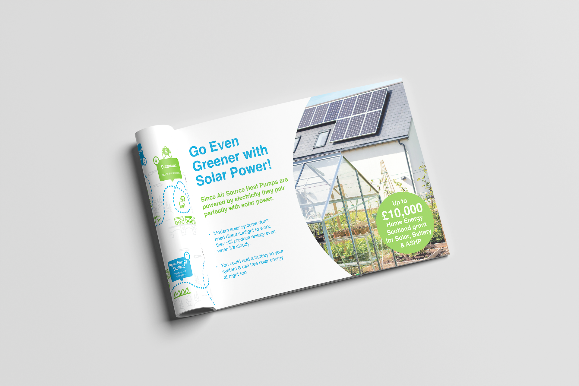
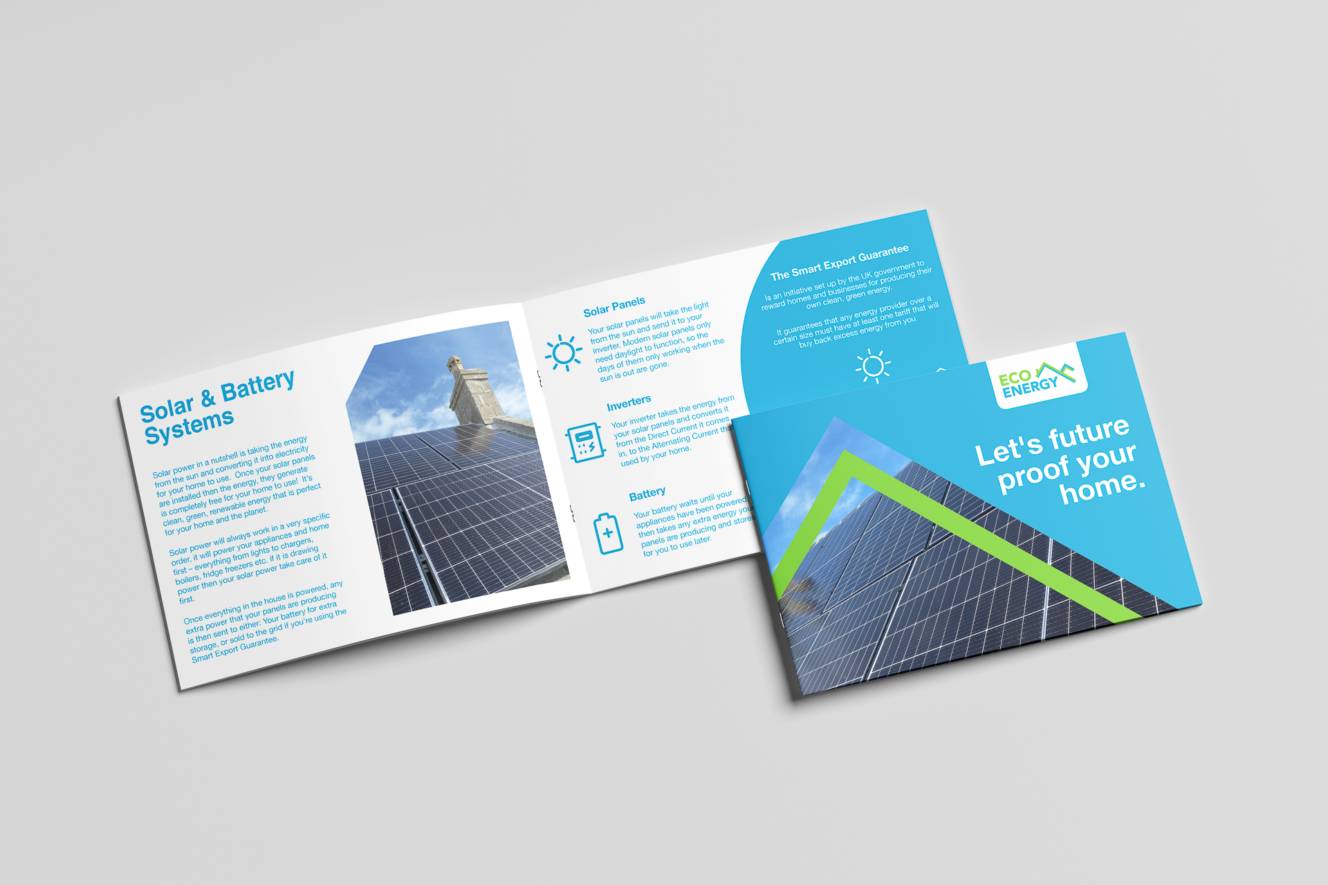
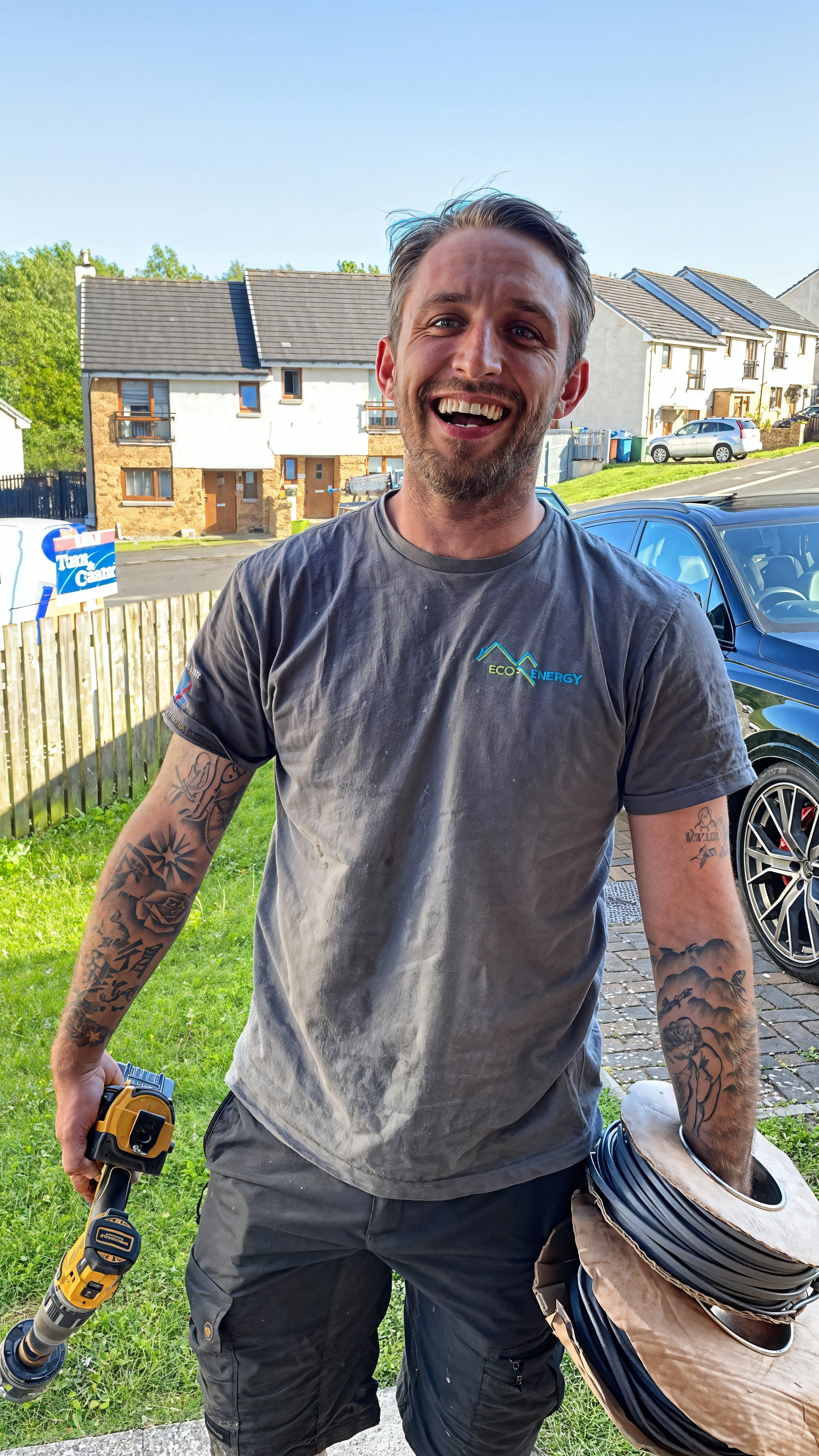
I carefully rethought the brand identity to feel more aligned with the company’s core values and the environmental landscape in which they operate. Natural scotish scapes thoughtfully influenced the new colour palette, typography, and imagery to evoke a sense of sustainability and connection to nature. I redesigned the brochure entirely from the ground up, crafting each spread with a focus on straightforward storytelling and clear, customer-centred messaging. The photography, layout, and copy style were thoughtfully balanced to help potential customers easily grasp the benefits of renewable energy solutions in a friendly and relatable way. The final design system was developed to be both flexible and practical, providing the Eco Energy team with a comprehensive toolkit they could confidently use as the company continued to grow and expand its reach.


The Result.
A more authentic and trustworthy identity that improved customer confidence.
The refreshed materials significantly helped Eco Energy communicate in a much clearer and more relatable way during consultations. As a result, customer enquiries increased noticeably, as the business presented itself with a much greater sense of professionalism and warmth. This new brand direction not only strengthened Eco Energy’s connection to local communities but also created a solid and reliable foundation for sustainable future growth.
“Craig created a brand that finally represents who we are. Natural, honest, and rooted in the communities we serve. The new materials have made a real difference to how customers see and trust the business.”
— Director, Eco Energy